1.0 Concept
The professional portfolio (printed and digital) must include the final pieces (with conceptual sketches) of work, covered over the semester and chosen pieces from the whole of the degree to provide the student’s final professional portfolio. This portfolio will be used to show future employers.
1.2 Software Choice
Pure Ref
PureRef is a software application that provides a simple and efficient way to organize, manage, and view visual references for creative projects. I have been using this application since it was introduced by the lecturing team during year one. It allows users to gather and arrange images, photos, screenshots, or any visual content in a customizable canvas-like workspace. PureRef is commonly used by artists, designers, animators, and other creative professionals to collect and refer to visual inspiration or reference material while working on their projects.
Canva
Originally, I tried this web-based program to substitute PowerPoint for presentation as it has a broad collection of templates. Since then, it has been my go-to software when making posters and designs.
User-Friendly Interface: Canva is known for its intuitive and user-friendly interface, making it accessible to users with little to no design experience. It offers a wide range of templates, pre-designed elements, and drag-and-drop functionality, simplifying the design process.
Design Options and Customization: Canva provides a vast library of design templates, fonts, graphics, and images, giving users a wide range of options for creating visually appealing print portfolios. It also allows for easy customization, enabling users to tailor the design to their specific preferences and branding.
Collaboration and Sharing: Canva offers collaborative features, allowing multiple users to work on the same portfolio project simultaneously. It also provides convenient sharing options, making it easy to share the portfolio with clients, collaborators, or prospective employers.
MS PowerPoint
Familiarity and Accessibility: PowerPoint is a widely used and familiar software, especially in professional settings. Many individuals are already comfortable with its interface and functionality, which can streamline the portfolio design process.
Slide-based Format: PowerPoint's slide-based format is well-suited for organizing content into distinct sections, making it suitable for presenting a structured portfolio. It offers features like slide transitions and animations, which can add a dynamic element to the presentation.
Advanced Editing and Control: PowerPoint provides extensive editing capabilities, allowing users to fine-tune design elements, layout, and formatting. It offers more granular control over text, images, and multimedia, enabling precise customization.
Although my initial idea was to use Canva to produce the portfolio booklet as it was one of the freely available software however PowerPoint proved to be more suitable in the end. When started designing in Canva it became apparent that 3 years of experience with PP, the vast amount of presentations, designs and posters I made provided more confidence to create the portfolio design within this interface.
1.3 Target Audience
It's important for 3D artists to consider their specific goals, niche, and target audience when creating their portfolios. Consequently, tailoring the portfolio content, presentation, and style to cater to the needs and preferences of my intended audience may greatly enhance its effectiveness. My target audience consisted of:
1.4 Research
As a digital media practitioner, I recognized the importance of design research in my work. Conducting design research allowed me to gain valuable insights into user preferences, market trends, and industry best practices. It helped me understand the needs and expectations of my target audience, guiding my creative decisions and ensuring that my projects were relevant and effective. By incorporating design research, I was able to create meaningful and impactful digital media experiences that resonated with users and achieved the desired outcomes.
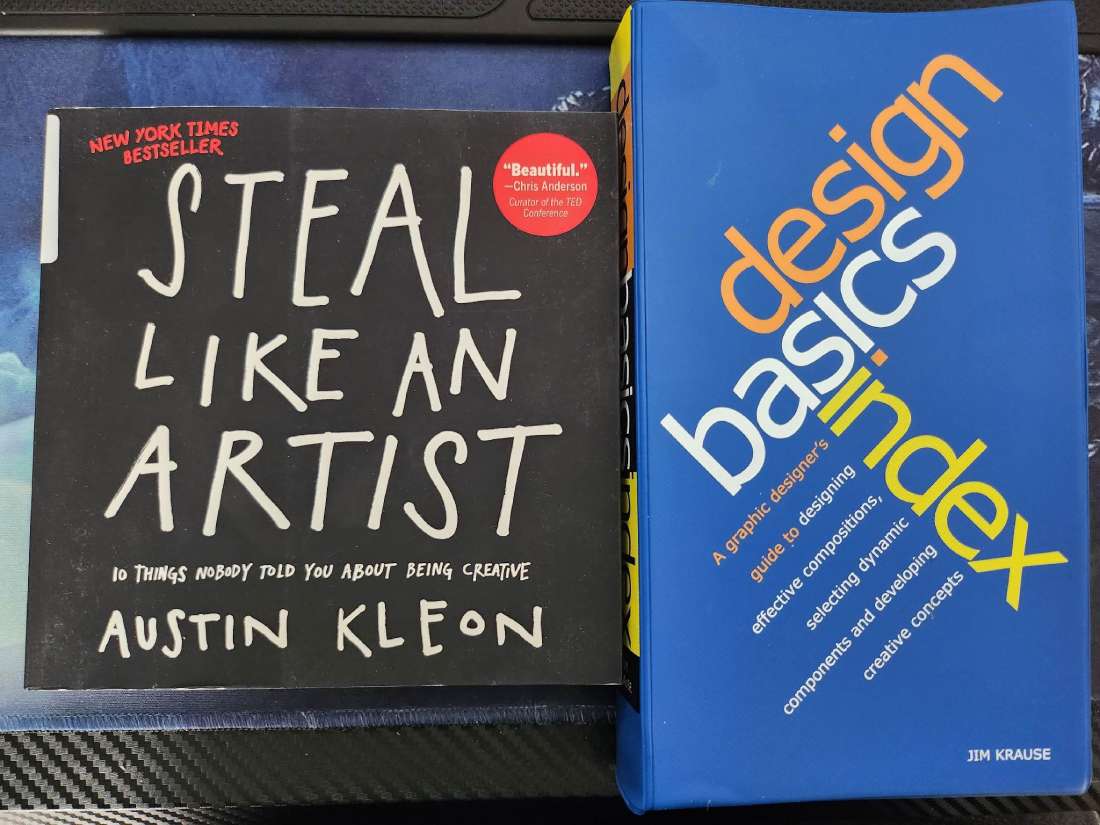
Beside the countless online sources there were two books that helped to shape my design immensely. (1.4.1) These are:
1.4.1
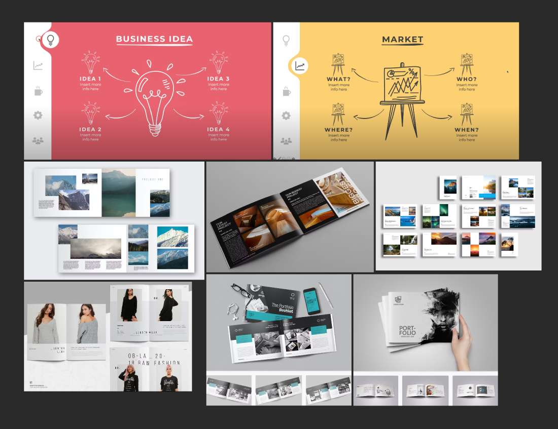
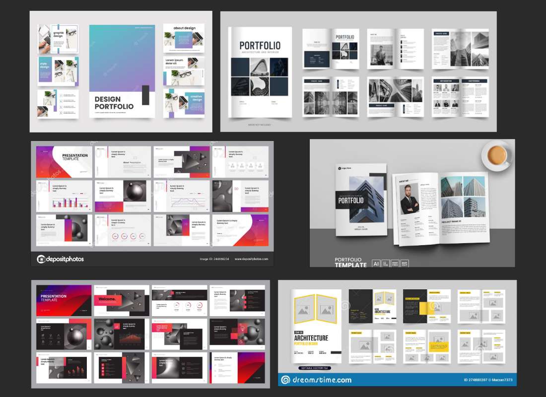
Some of the gathered portfolio booklet and layout references are shown in the two images below (1.4.2 & 1.4.3)
1.4.2
1.4.3
1.5 Initial Ideas
Design
In terms of layout I prefer a clean minimalist format. Besides a professional and sophisticated appearance it also conveys clarity. Consistency is a key principle in branding. By maintaining a uniform design style across different platforms, such as the portfolio booklet and website, I intended to create a cohesive and recognizable brand identity. This clear and well-defined presentation of personality in turn, ensures seamless user experience.
Great examples of the above are demonstrated in architectual and photography portfolios (1.4.2 & 1.4.3).
Printing Preferences
During a lecture we were presented with examples of printed portfolio booklets of students from previous years. Having physical samples rendered some of the decisions regarding to the overall design quite simple. I settled with an A5 size and a landscape orientation. Considering various sizes (such as A4, 210x210 mm and so on) and portrait orientation my choice fell on the above as a result of personal preference however evidence too supports this:
The choice of paper stock from the beginning was evident. Matte paper has a non-reflective surface, which can be suitable for portfolios that contain a lot of text or detailed images. It provides a smooth and elegant look. In contrast glossy paper has a shiny and reflective surface that enhances color saturation and contrast, giving images a vibrant and eye-catching appearance. It works well for portfolios that focus on photography, fashion, or other visually impactful content. Depending on content I generally favour this tipe of finish however, glossy paper is more susceptible to fingerprints and can be more reflective under certain lighting conditions. My choice therefore fell on silk paper that falls between matte and glossy finishes. It has a smooth texture with a slight sheen, offering a balance between the two extremes. Silk paper can enhance the colors and details of images while reducing glare and used in many of the portfolio references I have gathered.
Colours
To keep a coherent brand aesthetic my choice of colours were somewhat pre-determined. On my portfolio website beside the three main colours another two supplementary shades are used. (1.5.1)

1.5.1
With respect to the above for the portfolio booklet I made some minor changes.
By using a combination of these two colours (1.5.2), I was hoping achieve a balanced and visually appealing design. The dark grey provides a solid foundation, the white ensures clarity and focus on the content. This colour scheme creates a professional, modern, and engaging visual experience.

1.5.2
Typography
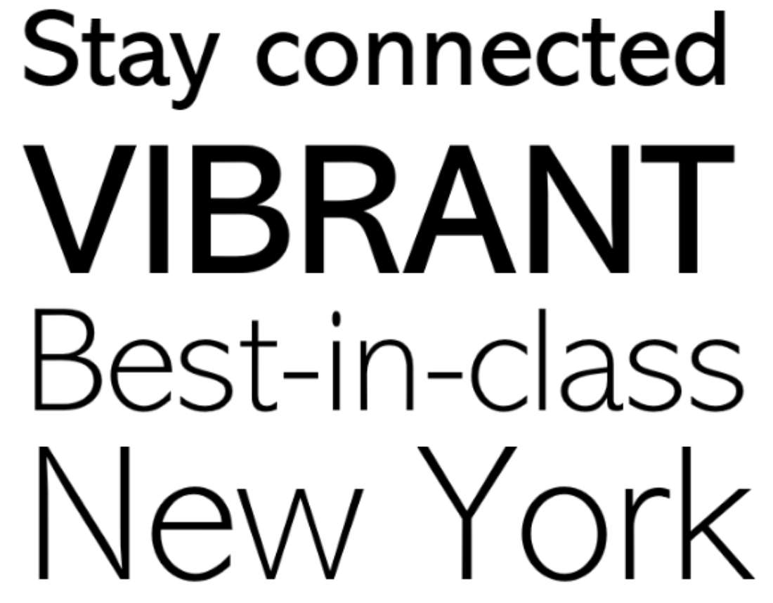
I opted for the "Abadi" font(various samples 1.5.3) which is a typeface that offers several advantages for use in print portfolios:
The following evidence from Microsoft also seem to support this:
Abadi, introduced in 1988 offers a versatile sans serif design whose style lies somewhere between the humanist Gill Sans and the more rigidly lineal Helvetica. Subtle humanistic characteristics give Abadi a friendly appeal and contribute as much to the typeface's legibility as does its generous x-height. This legibility keeps the typeface usable in smaller point sizes. Available weights, from light to extra bold, give Abadi a wide range of graphic applications, from magazines, newspapers, packaging, advertising, to use even with television. (alib-ms, 2022)
1.5.3 (alib-ms, 2022)
Bold Block Capital Letters
Bold block capital typography is great for printed portfolios for several reasons. Firstly, it grabs attention and creates a strong visual impact. Secondly, it enhances readability and ensures that the content can be easily understood. Thirdly, it helps establish a visual hierarchy and guides the viewer through the portfolio. Additionally, it also gives a modern and professional look to the portfolio and contributes to branding and consistency.
Design, Layout & Shapes
My choice of minimalistic design and the use of square shapes are generally considered beneficial for printed portfolios due to several reasons. Firstly, they create a clean and elegant aesthetic, focusing attention on the content. Secondly, they offer a timeless appeal that can withstand changing design trends. Thirdly, square shapes provide versatility and consistency in layout and composition. They also enhance readability and accessibility, while conveying a professional and sophisticated look.
1.6 Concept Development
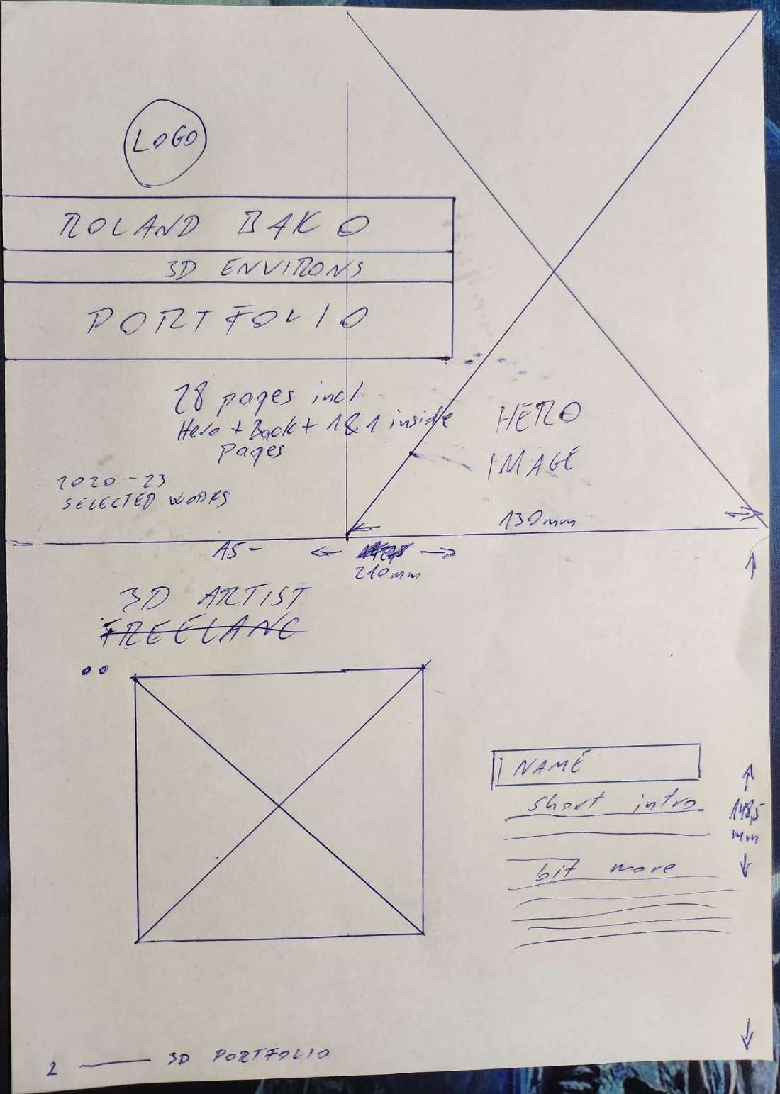
I had a rough concept in mind how I wanted to lay out my work within the booklet. Equally I have been guided by the references I had previously gathered. Initially I drew the wireframe for the front and intro pages (1.6.1). I measured and placed image holders and text boxes. A wireframe for the contents page followed. Lastly I created a rough template for the projects.
Beside the countless online sources there were two books that helped to shape my design immensely. (1.4.1) These are:
1.6.1
Design Accent
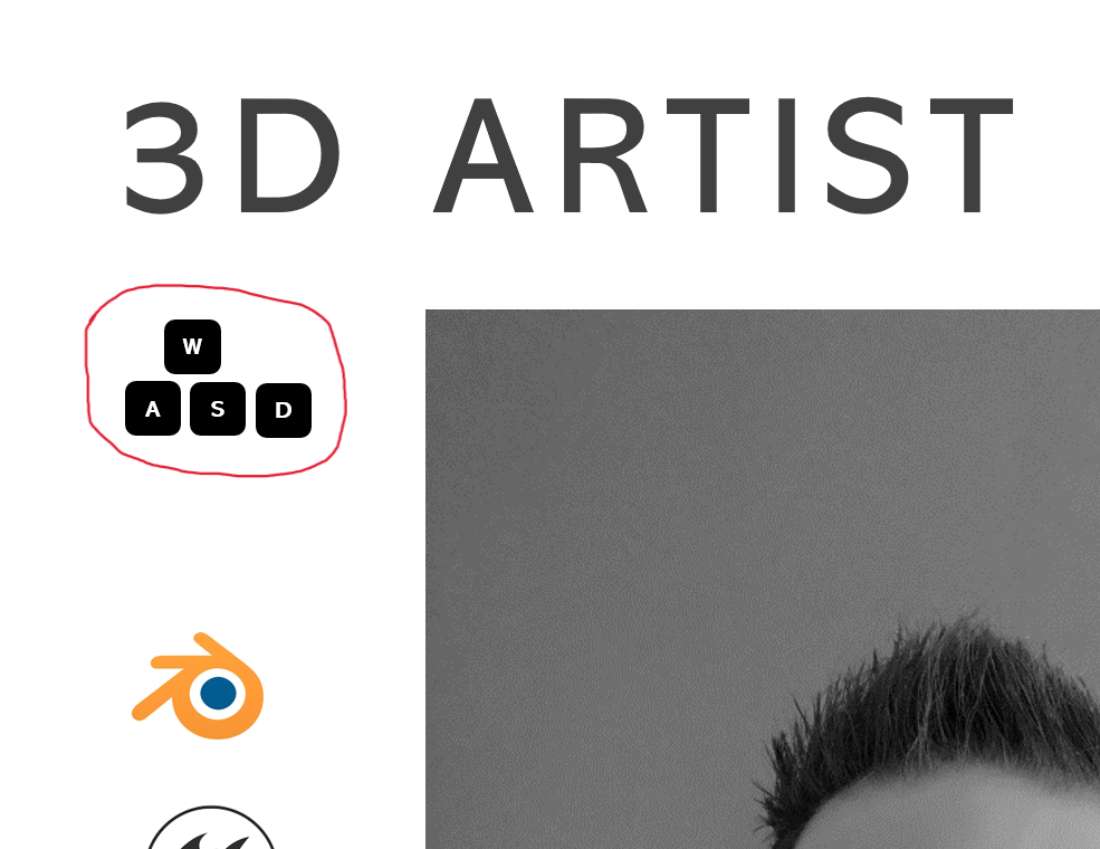
Many portfolios contain added design elements such as dividing lines small accents. I thought it would enhance the layout and add a personal toucth to it. Since I have a substantial gaming background and my primary auidence lays within the video game industry I created this miniature icon of the WASD keys. In almost all computer games these are the default keys on a keyboard that are used for forward, backward and strife movements. In PC gaming circles it shows associatiation to gaming.(1.6.2)
1.6.2
Contrast
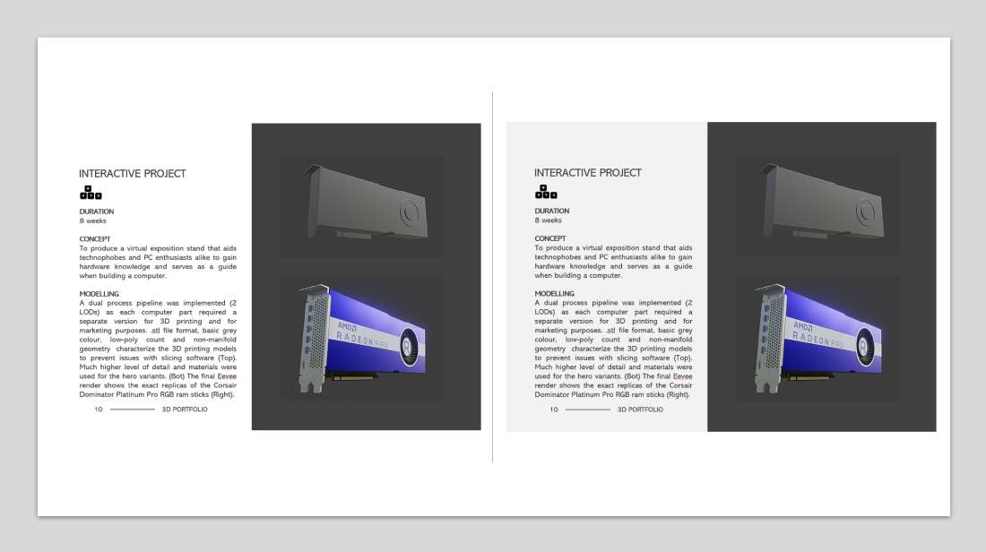
I considered using a less contrasting primary background colour for the pages. On my portfolio website the colour called Anti-flash White (#F1F1F1) frames my content against the white (#FFFFFF) background. I compared the two variants side by side and decided to stick with the white colour. (1.6.3)
1.6.3
1.7 UN SDGs
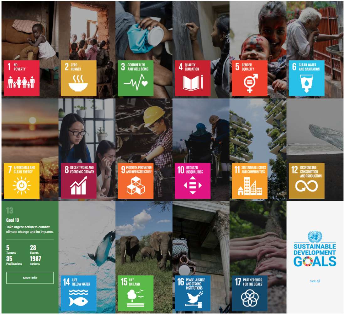
The United Nations Sustainable Development Goals (SDGs), also known as the Global Goals, are a set of 17 interconnected goals adopted by UN member states in 2015. The SDGs serve as a universal call to action to end poverty, protect the planet, and ensure prosperity for all by 2030. They address a wide range of social, economic, and environmental challenges facing the world today. The SDGs provide a comprehensive framework for addressing pressing global challenges and guiding efforts towards a more sustainable and equitable future. They encourage collaboration and action from governments, businesses, civil society, and individuals to achieve the shared vision of a better world for all. (1.7.1)
1.7.1 (UNASDG-IGO, 2015)
SDG 13
SDG 13, Climate Action, focuses on combating climate change and its impacts. It calls for urgent measures to reduce greenhouse gas emissions, build resilience to climate-related hazards, and mobilize resources for climate-related actions. The goal aims to protect communities, ecosystems, and economies from the adverse effects of climate change while promoting sustainable development. SDG 13 aligns with the global commitment to limit global warming and addresses the urgent need for climate action at a global scale.(1.7.2)
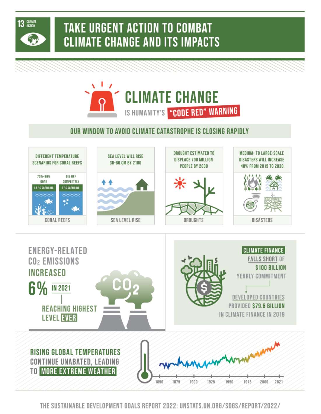
1.7.2 (Un.org, 2022)
Both on personal and professional level I am an advocate for the UN SDGs. From an early age I recognised the beauty in nature and the fragile balance of the ecosystem. Through experience and academic studies I have learned the issues sorrounding our planet. I actively analyze the impact of my actions and identify areas where improvements can be made. Some examples on a personal level:
Some of the climate action steps I take on a professional level:
1.8 Logo Development
For the creation of my logo I implemented the process designers typically execute. Since I had an already established brand identity, target audience, vision and business values that are normally covered through a briefing I started with the next stage:
Research
By conducting a research I intended to gain insights into the industry in general, competitors, and current design trends. One key aspect I wanted to incorporate into my logo design was a die. One of my lifelong hobbies is playing tabletop RPGs. These are often simbolizes by some sort of a die such as a six-sided dio or an icosahedron a twenty-sided die. My main 3d software is Blender and every single project within the application starts with 3 object. One of which is a six sided cube. Therefore my research have been heavily concentrated to similar logos (1.8.1)
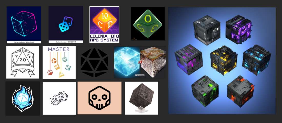
1.8.1
Conceptualization
Based on the information I gathered and brainstorming I sketch out multiple logo concepts. (1.6.2) Explored different visual elements, typography, and color schemes that would align with the my brand identity. I came across a simple logo of three overlapping squares that I liked and looked more professional than the die logos I have seen so far. Progressing on this idea I played around with the shapes and angles. When I finally decided on the general idea I opened Powerpoint. I know that this would be the last choice of applications for anybody with knowledge in logo design. I feel my choice however can be justified since I do not have access to or practice in any software suitable for this purpose other than Photopea (a web based PS like app). Instead I chose Powerpoint since the logo shape was simple quickly creatable and editable in PP.
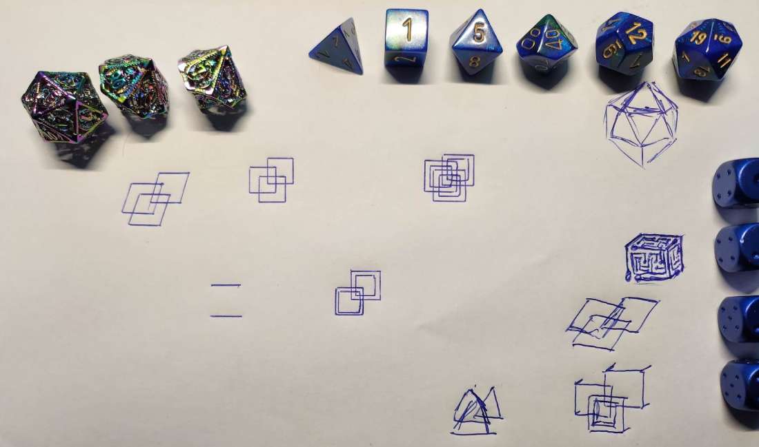
1.8.2
Concept Development
The images below demonstrate the stages of the logo design progression. (1.8.3 & 1.8.4) I intend to update my website during the summer with a more game oriented look and colours. With this in mind I wanted the logo colours to correspond. The gradient of dark-blue, azure and bright-pink are also the influence of the video game Cyberpunk but also the Republic of Gamers(ROG) a brand used by ASUS a PC hardware company. The initial sharp corners has been bevelled. I felt the rounded design translated to a more modern look. I tried variants of font types for both designs. I found that the ROG font worked well with the square corners while Arial Rounded MT Bold was more suitable to the rounded design. I tried changing the text direction then played around with gradient values and direction most suitable for the design. The shadow and its blur and transparency effects were tested in a few different ways. Finally I added a teal colour for a smoother gradiaent effect and scrapped the text leaving only the logo. The final variation can be seen on the bottom image (1.8.5).
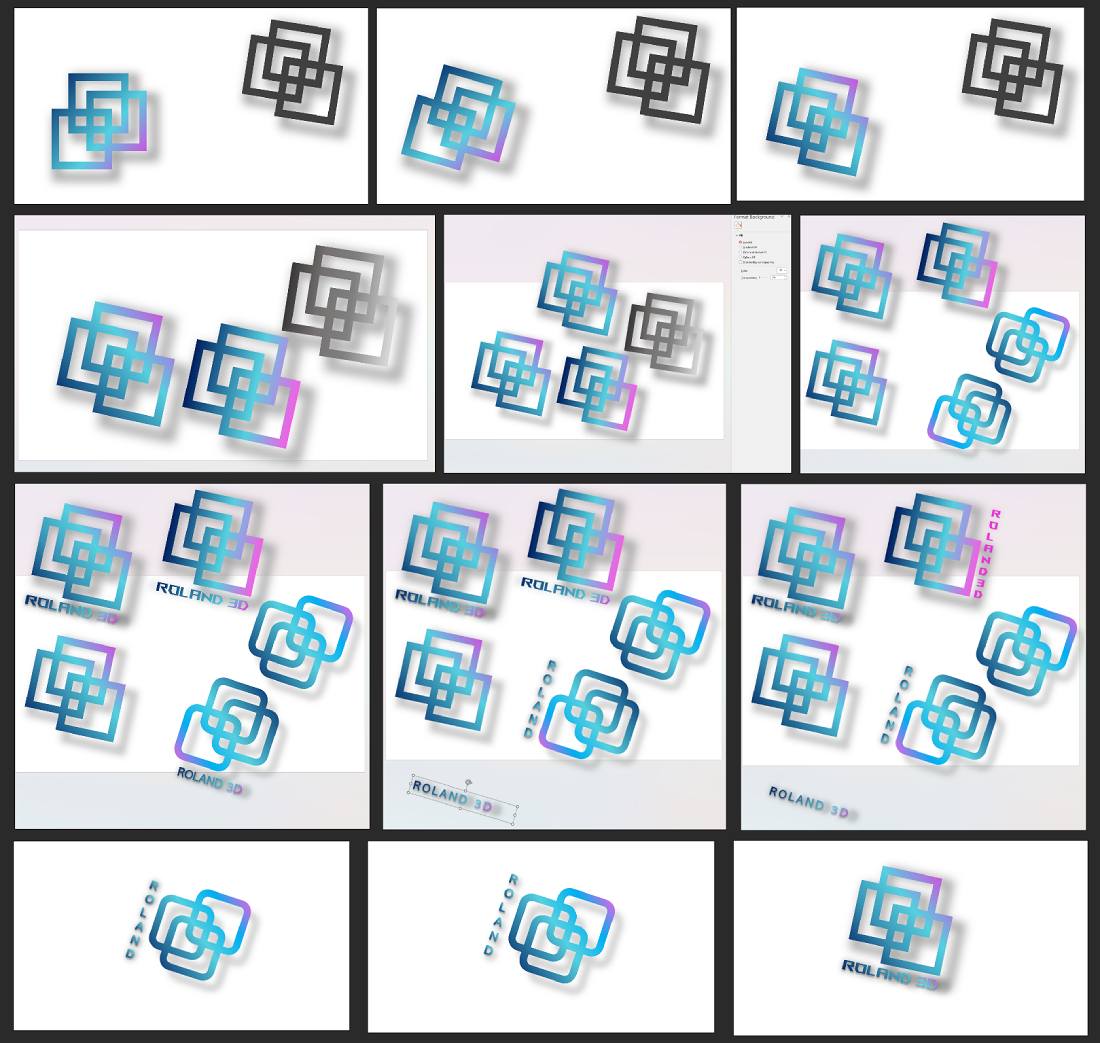
1.8.3
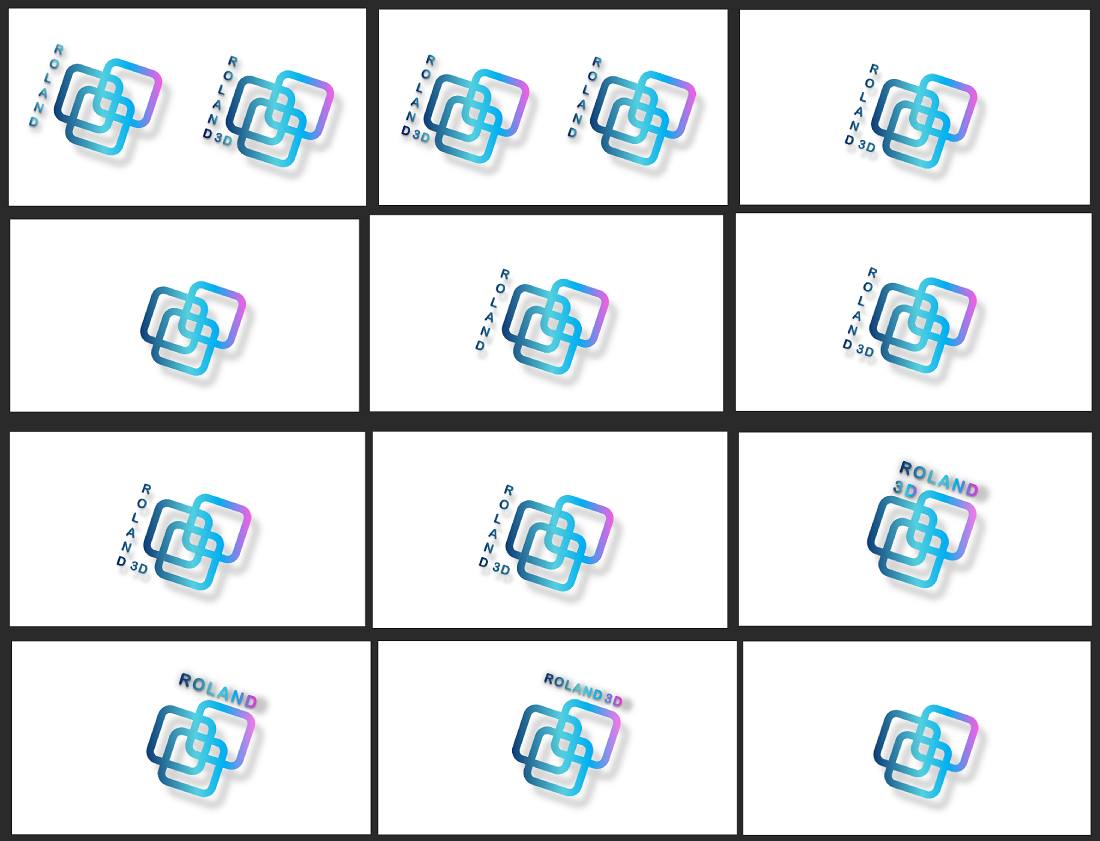
1.8.4

1.8.5
1.9 Preparation for Printing
When I prepared my portfolio booklet for printing, I considered several key requirements. First, I saved the file in a high-resolution PDF format to ensure compatibility and maintain the design's integrity. I included a bleed area of 2.5mm as this was recommended online for A5 size and left margins to ensure that images and colours extended to the edge without any white borders and kept important content away from the trim area. I used the CMYK colour mode for print accuracy and made sure all images were high resolution (300 dpi or higher) to ensure clear printing. I embedded or outlined all fonts and applied the appropriate colour profile to maintain colour accuracy. I organized the pages correctly, numbered them accurately, and thoroughly proofread the content for errors. I sent the file to the printing company I used. (1.9.1) Finally some iteration of bleed and crop marks parameters were needed.
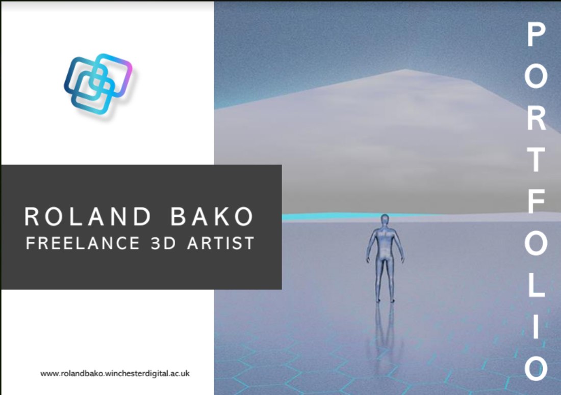
1.9.1
Initially I forgot to ask for printing specifics from the printing company and used settings as was recommended online. The Powerpoint included within Office 365 had no options for setting bleed and crop marks unlike earlier versions therefore I imported the pdf file to Canva. It was easy to set this and sent the files back for printing (1.9.2).
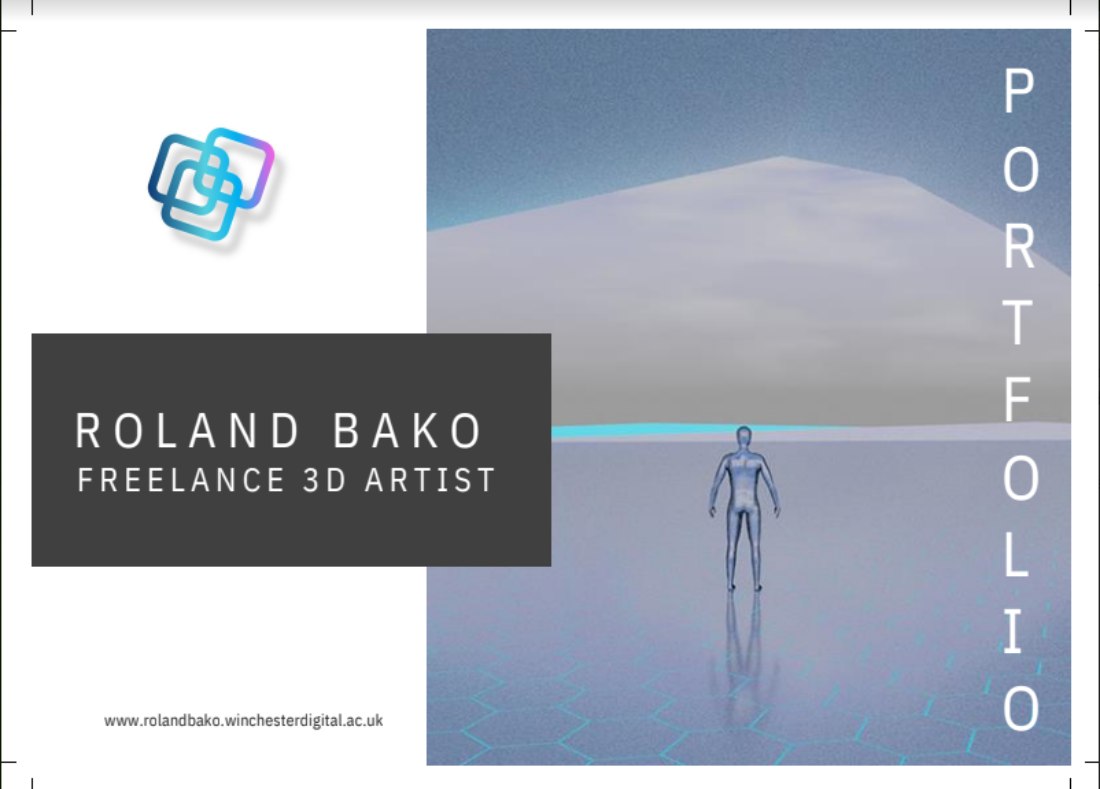
1.9.2
Only when I sent the files I realized that for some unknown reason Canva randomly changed some white text to black and vica-versa. (1.9.3) Handling imported .pdf, .pptx and .pptm file extension in Canva is still in a testing phase as I found out therefore not without issues. Unfortunately I could not fix this so eventually I reverted back to an earlier version of the .pdf. After consulting with the print shop I set 5mm bleed on all sides I sent the files back the last time.
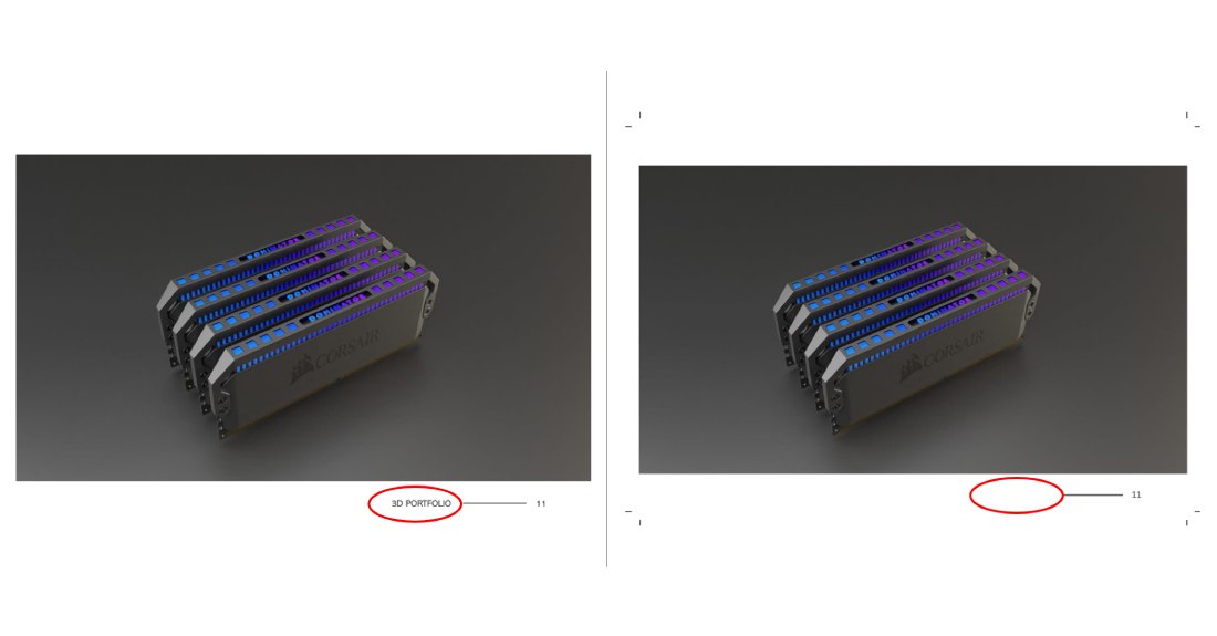
1.9.3
2.0 Feedback
Regrettably the portfolio booklet had not been finished printing before the 2023 Transmedia Exhibition. Despite this shortcoming I was able to show the digital version to one of the lecturers a few peers and some exhibition visitors. All comments received were positive depictint the portfolio as "very professional" and "great content". My lecturer noted how surprised he was refering to the professional design despite the lack of use of a proper layout design and desktop publishing software.
2.1 Conclusion
In conclusion, the print portfolio design assignment successfully(in my opinion) achieved its objectives of creating a visually appealing and professional portfolio for showcasing my 3D work. The design process involved careful consideration of layout, typography, color scheme, and overall visual coherence to present the project and skills I used throughout the university years in an engaging and cohesive manner.
My experience with Powerpoint has been highly enriching as I have learned a great deal and familiarized myself with several new techniques, while also enhancing my existing skills. The alternative use for Powerpoint as a tool to design a print portfolio booklet from start to finish, including the logo, has been a game-changer. By thinking outside the box and exploring the capabilities of Powerpoint beyond presentations, I have unlocked a new avenue for creative expression and streamlined my design process. The This newfound knowledge has allowed me to elevate my presentation design abilities and deliver more engaging and impactful content in the future.
In retrospect the one aspect I would change is the hero image. Due to the original render's graininess the quality of this image is not on par with the rest of the content. The added benefit of learning about printing specifications may just prove to be useful. Overall I am happy with the final outcome and proud of my work (2.1.1).
CLICK HERE FOR THE DIGITAL VERSION!
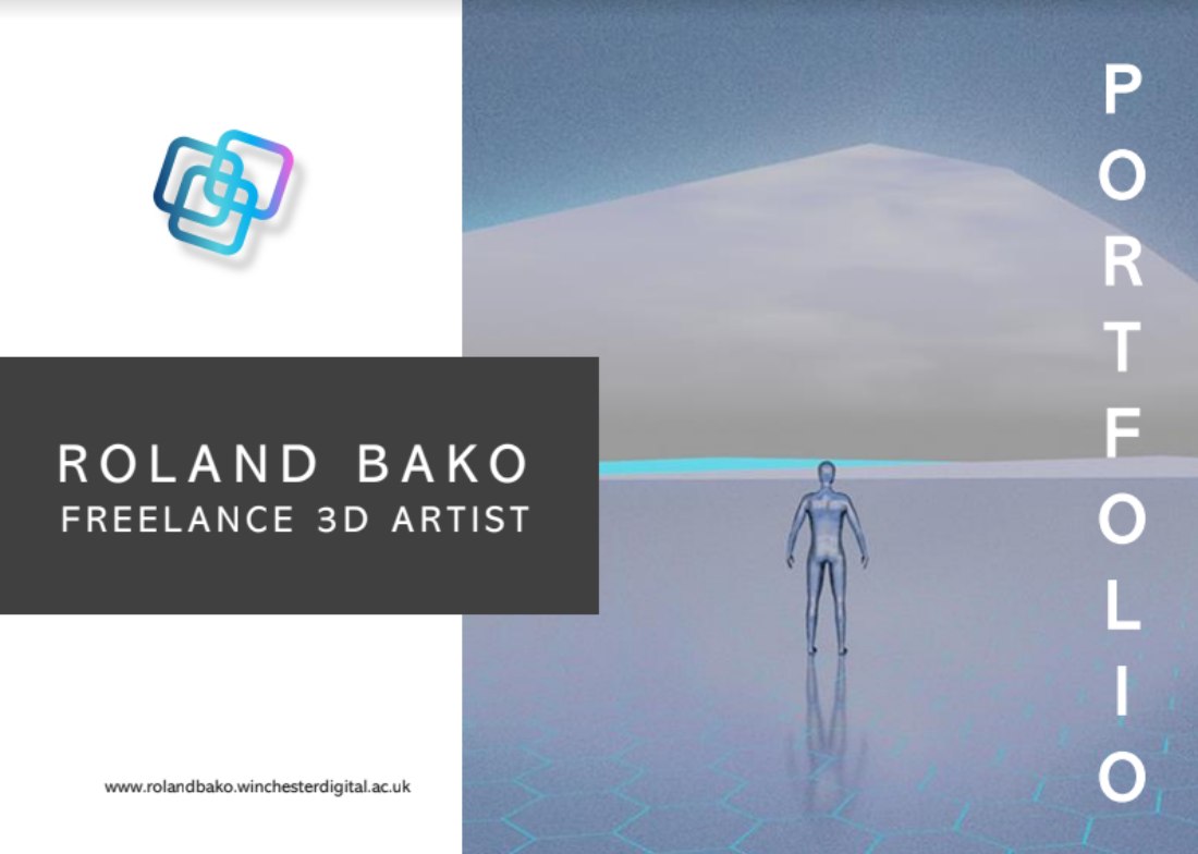
2.1.1
2.2 References
alib-ms (2022). Abadi MT Condensed font family - Typography. [online] Microsoft.com. Available at: https://learn.microsoft.com/en-us/typography/font-list/abadi-mt [Accessed 14 May 2023].
UNASDG-IGO. (2015). Discover the SDGs | UNASDG-IGO. [online] Available at: https://www.unasdg.org/discover-the-sdgs [Accessed 03 Apr 2023].
Un.org. (2022). Goal 13 | Department of Economic and Social Affairs. [online] Available at: https://sdgs.un.org/goals/goal13 [Accessed 01 Mar 2023].
alib-ms (2022). Abadi MT Condensed font family - Typography. [online] Microsoft.com. Available at: https://learn.microsoft.com/pt-pt/typography/font-list/abadi-mt [Accessed 12 May 2023].