1.0 Project Aim
1.1 The Team
1.2 Software
Apart from Blender and a brief encounter with Megascans I had no previous experience with the rest of the software used throughout the project. My personal development goals coincidingly with one of the aims of the 3D Environments module this year is to gain familiarity with new industry standard programs. I was thrilled about the learning opportunity and its challenges.
1.3 Approach
Our approach towards the project has changed significantly after few weeks. Initially the project was to be utilized by the CSI department only as stated in the original brief however it was indicated by university lecturers that it may be developed further to function as an educational VR application for multiple departments (such as the faculty of health and wellbeing) in the upcoming semester. I wanted to contribute more to the project than just making a room described in the initial brief keeping client needs and the future cross-faculty use in focus. Therefore, I created the whole house and garden.
1.4 Research
Commencing the project research, I mainly concentrated on its sole CSI function but after realizing the multi-department purpose my search widened. Beside learning about the intricate details of crime scene science and processing I looked into similar programs currently available as virtual reality education software.

1.4.1 image sourced from med-technews.com
1.5 What is CSI
Crime Scene Investigation is a forensic science conducted by specially trained members of law enforcement agencies or civilian crime labs also known as crime scene investigators. Supporting both the judicial and investigative sector of the criminal justice system in the process of solving crimes and securing convictions by applying scientific methods and technology to process material evidence and interpret findings.
1.6 The CSI Method of Processing Crime Scenes
Crime scene investigators usually have a three-step approach when processing a scene.
1.7 Mood Boards
Collecting reference images to any creative work is one of the most fundamental phases of the design process. I tend to go through hundreds of images and videos to form a concept of the base design then narrow the number down keeping pictures on a constant display throughout modelling.
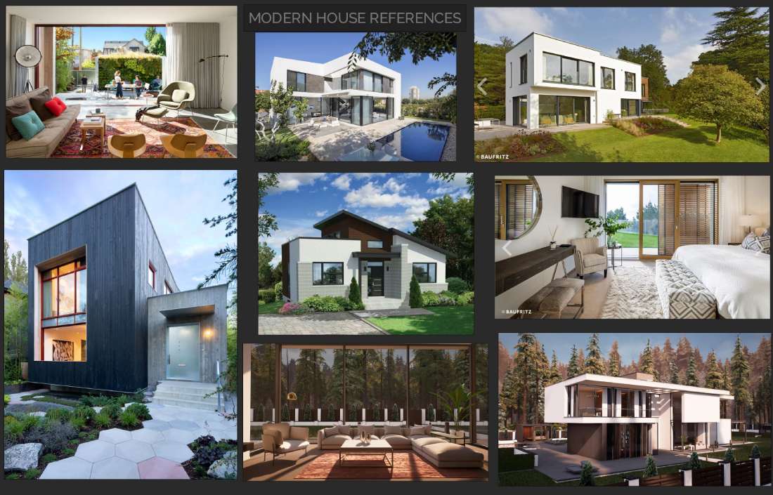
1.7.1 My modern house mood board
1.8 Developing Personas
In order gain better understanding of client requirements and to improve user experience one key stage of the research was to establish personas. To cover the main spectrum of end users I developed three personas. Each targeting a specific client group.

1.8.1 Persona#1 3rd year student

1.8.2 Persona#2 University Lecturer
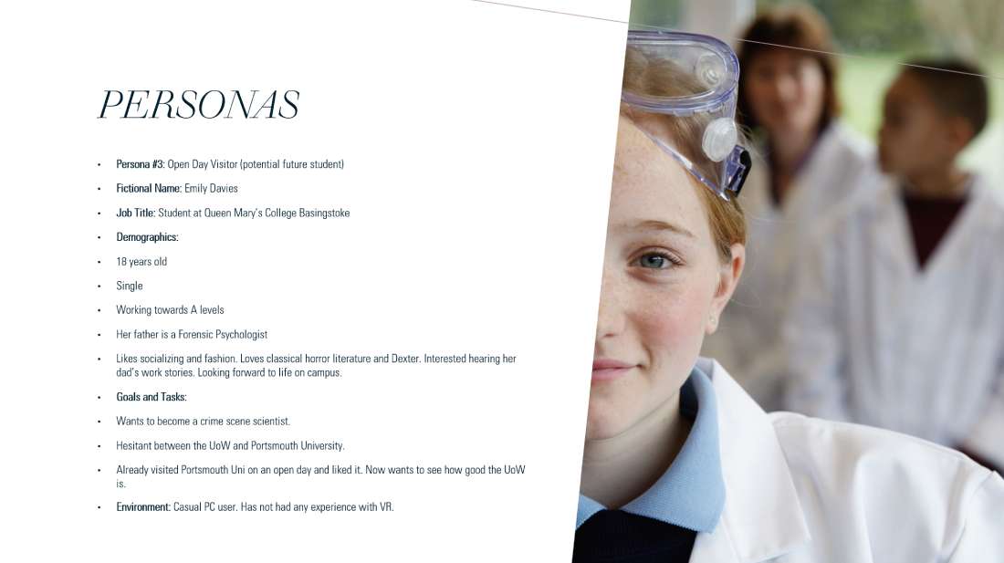
1.8.3 Persona#3 Open day visitor (potential future student)
1.9 Optimizing for VR

2.0 Initial Client Feedback
Succeeding the original client brief our group realizing ‘the problem’ started to draw sketches and gather information on the subject. Meetings spent brainstorming and analysing ideas then we developed a solution. Following the early phase of the design process, we had a client meeting where our concept was presented to one of the university’s CSI lecturers. This was a great opportunity for feedback and some inside knowledge not just on crime scene investigative practices but gaining a better understanding of client needs as well. From my perspective this changed the formerly dark house design to a substantially more modern approach.
2.1 Structuring
2.2 Smartdraw
For the first client presentation we wanted to show the basic layout of the scene. I used Smartdraw to generate a quick outline of the room and it's contents. (2.2.1) Smartdraw is an online application with a downloadable edition. I considered drawing the floorplans with it because the client and I both appreciated the stilized cartoonish characteristics of the drwings however as my Revit skills improved and the multi dimensions of the project became apparent it seemed considerably better fit for the purpose due it's professional appearance and efficient workflow.
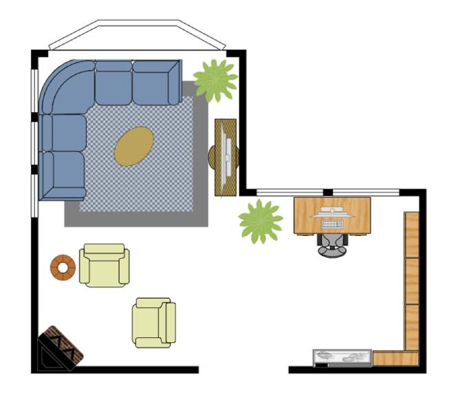
2.2.1
2.3 Learning Revit
Throughout the course of four to six weeks I gained familiarity with Autodesk Revit. Although this industry standard software initially fell outside of the scope of my plans for this semester but by the advice of my lecturer through trial and error I progressed from the basics towards more advanced techniques. At first, I was somewhat sceptical given the time constraints of the project and knowing that I could model the house in Blender in the fraction of the time. Nevertheless, I remained focused and carried on practicing. (2.3.1) Retrospectively I realized that despite Revit is a rather architectural visualization-oriented application its benefits are still invaluable, creating structural plans or assets with accurate dimensions swiftly. It will certainly be a great addition to my software knowledge and prove to be a great asset in future projects.

2.3.1
2.4 The Modern House
Once we estabilished with the client that a modern house was to be designed I researched the topic extensively. Architectual visualization websites and company pages provided plenty of examples featuring the main style characteristics. I visualized the chunky, squareish cocrete walls, incorporating a flat roof, huge glass panels and clean looks.
2.5 Siteplan
Constructing the site topography was relatively straightforward, In Revit’s site view I added a toposurface then made the boundaries of the topology. By changing the hight of elevation points the rough topology was practically done. I set the elevation and added more points outside the created boundary for beginning and end points of surface elevation lines for smoother surface. As a last step I added more elevation point to the elevation lines inside the boundary to fine-tune the surface. Comparable to real life constructions where terrain is levelled in order to shape grounding to conform to the foundation levels thus allowing to prevent overlapping between surfaces.
2.6 Glass Walls
Albeit that glass surfaces fail to work when exporting assets from Revit to Blender or Unreal Engine I learned to produce them. This way it was included in the Revit renders to resemble the final works. Including the glass walls was a slight and only diviation from my lecturer's suggestion of rather having framed windows. I felt it was necessary in order to preserve the contemporary image I imagined originally. At the second client meeting I received positive feedback therefore it was included in the final version.
Before gaining additional experience in Revit I was trying to cut out sections of walls to change the material into glass. While this was done with ease vertically the same thechnique did not work horizontally. The effort seemed futile and time consuming therefore I found an alternative solution. I changed the material of the whole wall section to glass. To achive this after highlighting the wall a click on edit type in the wall properties panel opens up a material browser window. First the wall needs to be duplicated and renamed to glass wall so the other similar walls already included will not inherit the same material properties. Then in the type parameters tab the wall thickness was reduced from 200mm to 50mm and the material modified to glass. (2.6.1) As a final touch the glass panel was aligned with the external walls.
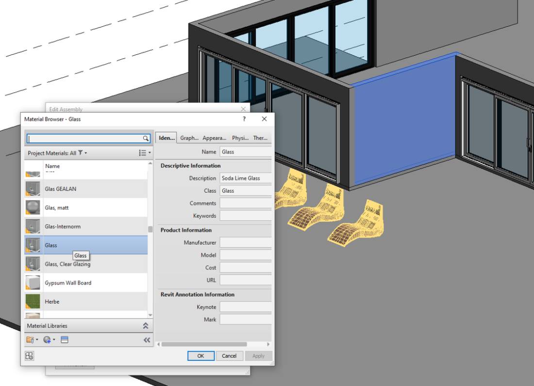
2.6.1
2.7 Glass Staircase
To align with the modern design I prefered to include a glass staircase. A slight issue I had to solve was when placing the stairs connecting the ground floor to the 1st floor to make a floor opening. (2.7.1) Steps include adding a staircase, set top level to 1st floor level then the number of raises and actual thread depth required modification to connect the floors. Changing the railing to glass panel followed. Lastly I drew a boundary line to make the opening.

2.7.1
2.8 Building Progression
I swiftly progressed by populating the 1st floor (2.8.1) and adding the roof and some outside elements including the swimming pool. (2.8.2)
2.9 The Fence
3.0 Render Settings
The following main settings were used rendering the scene in Revit.
3.1 Creating Metahumans
One of the project requirements was to achieve near life like visuals quality in order to the user to assimilate with the ambient scene. One of the leading element of this is the dead body within our scene. I hoped to achieve this by importing assets from from Unreal Engin's Metahuman Creator. This application utilizing a similar character building method as current AAA RPGs yet the difference is that the models created can be exported as fully rigged high fidelity assets. The efortless three step process employs Quixel Bridge another application by Epic Games serving as a symbolical bridge between softwares. (3.1.1)

3.1.1
3.2 Metahuman Stories
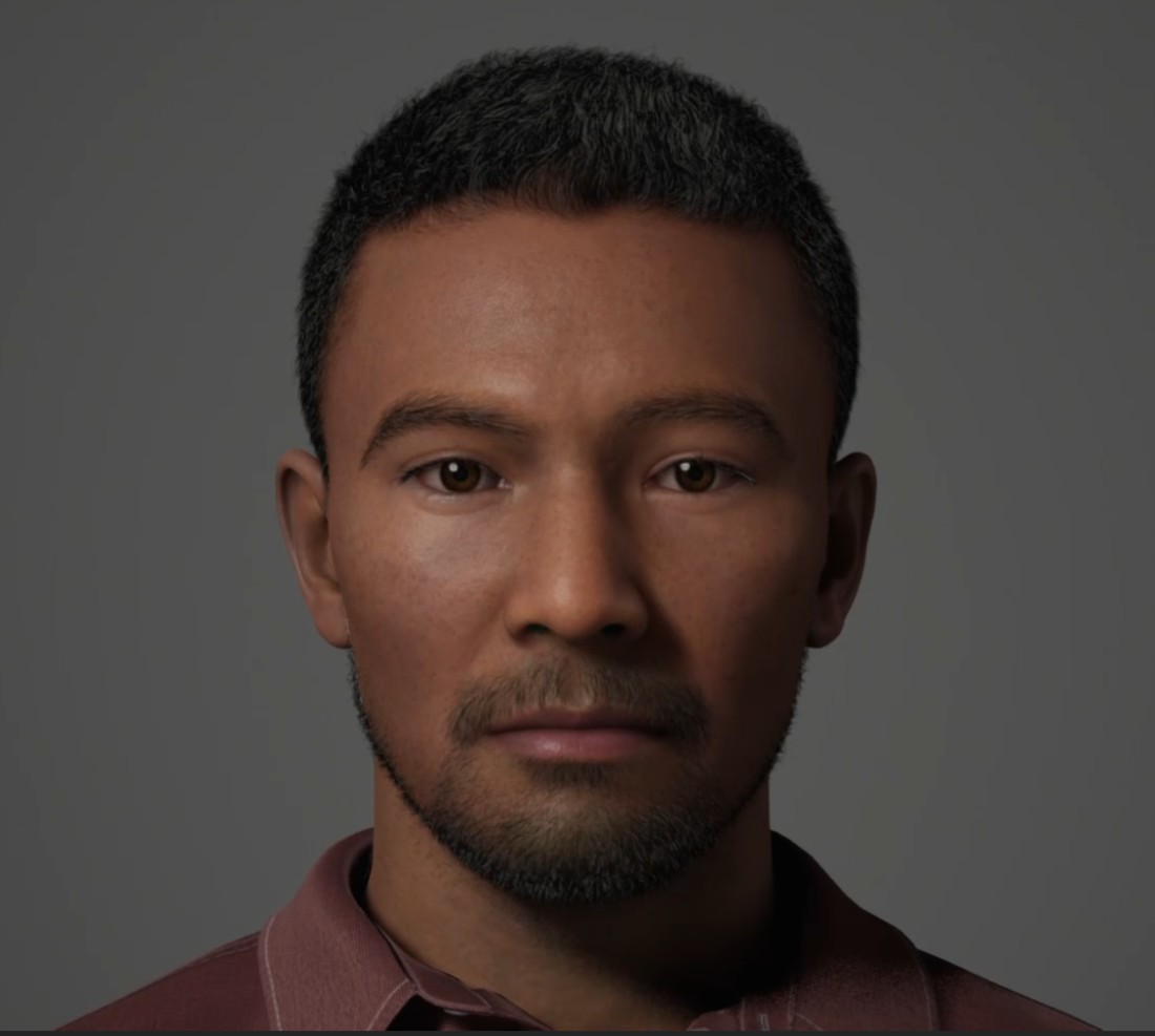
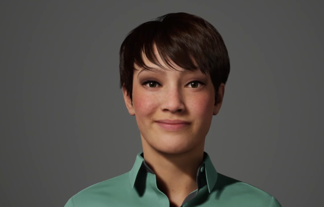
An interesting proposition I heard by a number of leading 3D creatives mentioning in online videos and tutorials stayed with me. According to the suggestions if one pairs an imaginary story to his/her creation it encurages a better connection between artist and concept (the scene, an asset or alike) therefore boosting efficiency and enthusiasm. I applied this idea to the character creation making detailed personas for the metahumans serving as victim. (3.2.1 and 3.2.2)
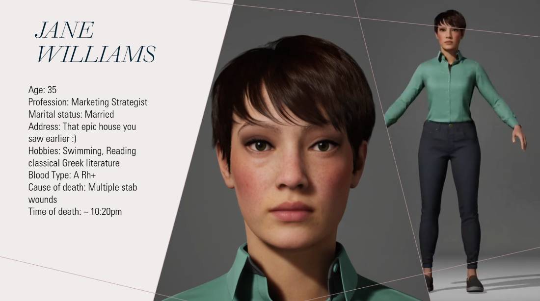
3.2.1
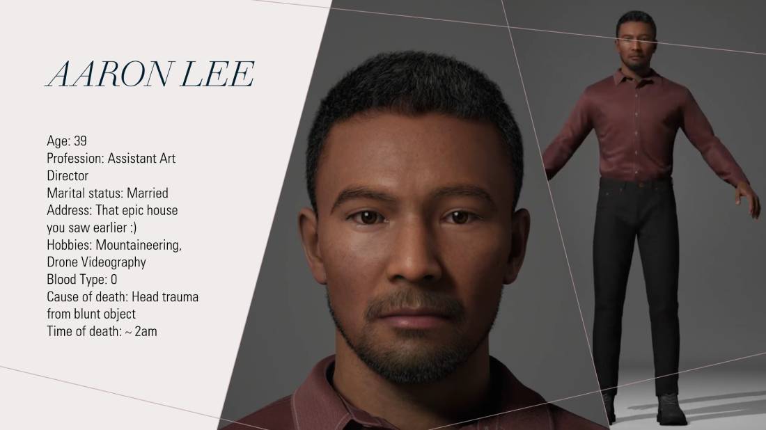
3.2.2
3.3 Level of Detail
As mentioned earlier visual quality is viyaly important for project success. This however cannot ruin user experience by overloading system resources. 3D programs mitigate this by employing the level of detail (LOD) system. Fortunately all characters produced by the Metahuman Creator inherit LOD levels from 0 to 7. Zero being the highest fidelity version progressively reducing quality to 7. This helps alliviating pressure from the computer system by applying lesser quality version of the asset to the scene as viewing distance increases. The below image demonstrates differences between LOD0 and LOD7. (3.3.1)
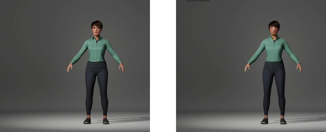
3.3.1
3.4 Charater Sculpting
Generating unique faces is the focal point of Metahuman Creator. Currently there are 50 premade characters that can be chosen and/or custumized. An inheritance system is also integrated into the application making any parental facial features inheritable by the generated character. I chose six distinctive character examples mixing their appearances then furter adjusting them by the numerous anchor points. (3.4.1)
3.4.1
3.5 Zoom and Fidelity
The below scrren recording reveals my characters zoom and fidelity levels.(3.5.1)
3.5.1
3.6 Movement
All metahumans are fully rigged and can be imported into Blender or Unreal making them ideal to the project purpose. Possible movements are showcased on the below screen recording.(3.6.1)
3.6.1
3.7 Project Timeline
The Client Group Project spanned across the whole first semester of year two. The included gantt charts show the entire project pipeline in weekly interval breakdown. The first chart is our group gannt only highlighting the three different pathways representing design by Abi Kusneraitis and 3D Environments by Luke Raynsford and Roland Bako from the Digital Media Development Department. (3.7.1) The second more detailed chart shows the breakdown of my workflow and important deadlines. (3.7.2)

3.7.1
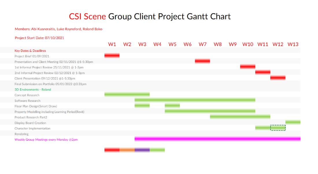
3.7.2
3.8 Exhibition Poster
This is my entry to the Academic Poster Exhibition by the Digital Media Department.(3.8.1)

3.8.1
3.9 Conclusion
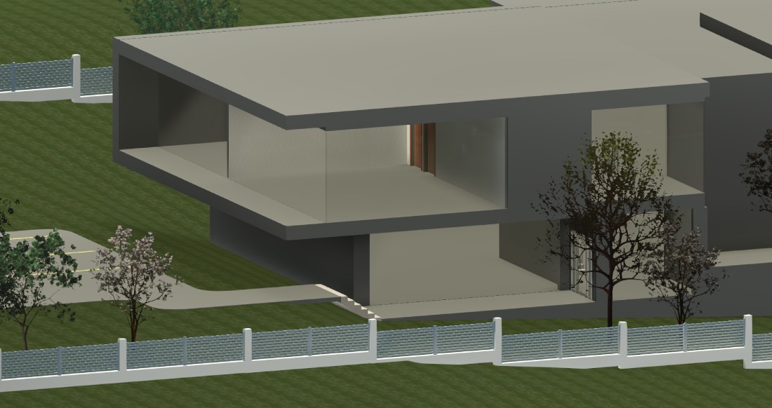
I always find it difficult to summarize such a project within a paragraph. Countless hours of creation resonate fondly in my memories. Equally the research stage that can lead to many mindbogling discoveries. The Metahuman Creator and UE5 are true testaments to visual evolution in the 3D industry. I really enjoyed working with the former and hope to get involved more with the latter in upcoming projects.
At the start of the semester I may have thought I would rather create the house in the familiar platform of Blender nevertheless leaving the convenience of one's comfort-zone is a personal development adventure. Learning a new software is always time consuming but I am proud of the progress I made in Autodesk Revit. The plethora of techniques will be invaluable additions to my arsenal. It proved to be a great decision and also demonstrates the expertise and judgemental value of my lecturers.
Not necessarily a skill but definitely an important concept is to find connection with my work through an imaginary story. It helped to stay motivated throughout the project.
I am greateful to be part of the project and excited about what the second semester will bring about.
3.9.1
3.9.2
3.9.3

3.9.4