1.0 Concept
The individual Development Portfolio according to the assignment requirements should be a culmination of techniques learned throughout the past three years. Originally, I had several ideas to fulfil these and various additional purposes. An early idea during the second semester of year 2 was to create a biophilic virtual reality office or study environment. This might have been useful as an academic support piece corroborating my dissertation, however as my written topic developed further during the 1st semester of year three, I deviated from this concept. I decided to bolster my collection with environments excluding VR. This way I could hone my skills and focus my portfolio towards my target audience.
1.2 Software
Pure Ref
Software used to create these two projects include Quixel Megascans, Quixel Bridge, Photopea a free PS alternative, Textures.com and Blender. In order to complete or in some instances speed up my workflow the following Blender Add-onns were utilised:
1.3 Target Audience
It's important for 3D artists to consider their specific goals, niche, and target audience when creating their portfolios. Consequently, tailoring the portfolio content, presentation, and style to cater to the needs and preferences of my intended audience may greatly enhance its effectiveness. My target audience consists of:
I researched many articles, recommendations and professional portfolios in order to undertand what makes a porfolio stand out. Sources similar to (Games, 2020) recommend that works presented within 3d artist's portfolios should the meet the following:
My goal with these two projects was to fulfill these key points as best as I can. Although I am not seeking employment after my undergraduate studies as I already applied to a postgraduate course in Digital Media Developmet I would very much like to keep my portfolio fresh and engaging. Reflecting back to the work previously displayed in my website and considering previous feedback from peers, lectures and industry professionals I believe these projects can significantly bolster the quality of my portfolio website.
1.4 Initial Ideas
Even if I am not working on a particular project with included briefing, I constantly generate new project ideas. It is almost like a subconscious brainstorming. They often start with a thought that seemingly comes out of nowhere or by inspiration of a book, image or a game environment. While many gets postponed or dropped, I learned the importance of documenting these ideas in one way or another. This is certainly a useful practice to keep in order to avoid forgetting these valuable conjectures. This was to my upmost benefit for current projects as I sometimes struggled to come up with original concepts for specific briefs. I used to keep a box that I collected cut out images of inspiration. It served a similar purpose as a sketch book in a way, which I also have many. Nowadays I also keep a folder called ‘Inspiration’ where I have collected thousands of pictures, videos, sketches. These of course can take the shape of almost anything of any mediums. Throughout the years I obtained simple things such as pictures from movies (one of the first was an image of the closing scene from Indiana Jones and the Last Crusade where Indie and co ride out of the ruins of Petra). Equally I have some of my own creations in terms of doodles and sketches or pictures I took while on holiday from a rusty car an interesting rock formation or an old, bolted door to mention a few.
Some of these ideas, inspirational items develop into a concept this is the second phase where many of them stay for months or even years. I create further sketches, moodboards or even a blockout in Blender. These are organised by their name in a specific folder on my computer. At this stage purely named after the leading idea that stimulated them. On some occasions I take them even further researching details and start modelling them. Recent ideas that reached this point are an Imperial Star Destroyer, A dwarven burial chamber and a post-apocalyptic city scene.
Concerning this assignment, I thought one project would be great but two even better. Working on multiple projects allows the development of a broader range of skills. Having a diverse portfolio showcasing multiple 3D projects can make one more appealing to potential clients and employers. My two concept ideas were:
From this point on the two projects will be presented separately. 1st the cave project will be described in detail from research to rendering then I go over the station project as well.
1.5 Research
I created five moodboards each showing a collection of images. These serve as invaluable tools, offering a range of benefits and applications. Firstly, a moodboard helps in establishing a visual direction and overall aesthetic for a project. By gathering and arranging a collection of images, colours, textures, and references, I was hoping to ensure a cohesive design and a constant source of inspiration throughout the project. Additionally, it contributes to a more streamlined workflow and compelling final results.
I started by collecting visuals for caves in general just to gain an overall feel. At this stage I was not trying to establish anything specific. References include both fantasy and real-life settings, stalagmites and stalactites, natural and artificial elements (1.5.1). Personal experience also helped forming my decisions as I have visited to a great number of caves during my travels. I was determined to include the followings:
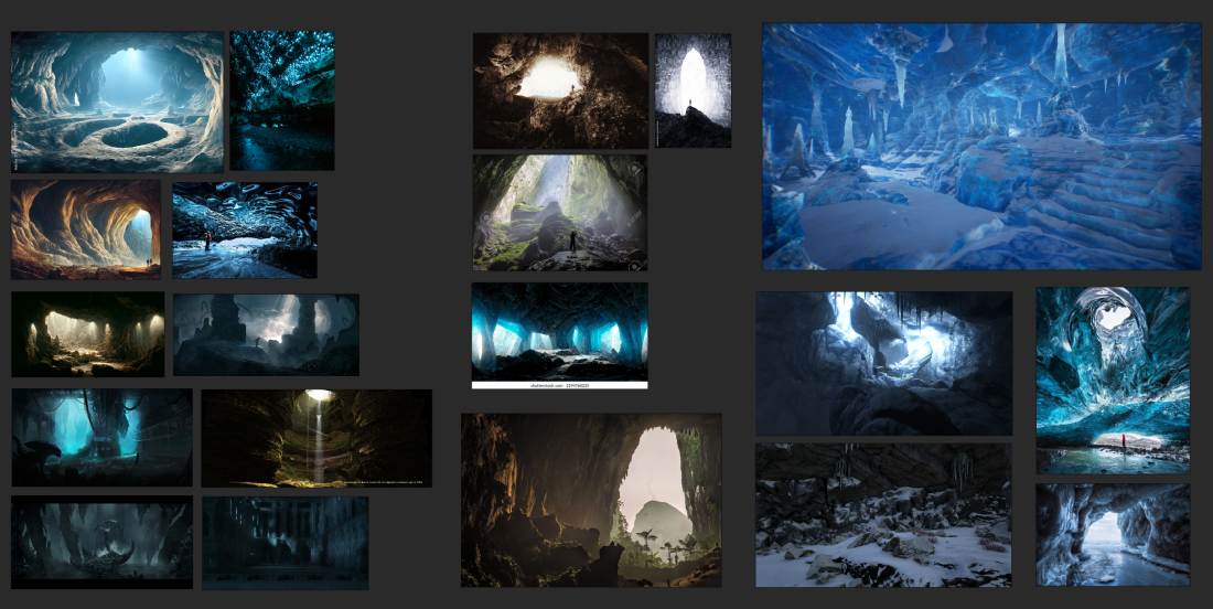
1.5.1
I was considering that the cave might be of alien origin with futuristic lit up walls/ perhaps an animation. The second board shows references of blue ice formations, frosted windows and glass surfaces and lights behind these materials (1.5.2).

1.5.2
Another thought was to have a dwarven great hall framed by huge pillars such as in during the Moria scene in the The Lord of The Rings - The Fellowship of the Ring movie. I collected dwarven references regarding to the shapes and motifs that are tipical to this fantasy art style (1.5.3).
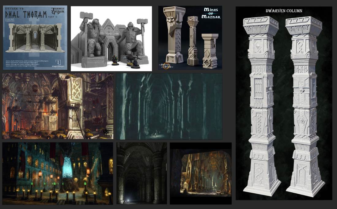
1.5.3
This next moodboard shows a number of close-ups of materials, building and corridor shapes of futuristic sci-fi races (1.5.4).
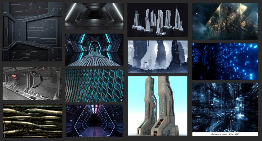
1.5.4
Another idea that is closely related to dwarven architecture. weapon and armour smithing and art is the use runes. While there are countless examples of these within the video game rpg genre their roots come from fantasy literature and real life alphabets. J.R.R. Tolkien famously created whole languages when writing the LoTR books. Such was the Khozdul the dwarven language. There are several runic alphabets that have been used historically across different regions. The most well-known runic alphabet is the Elder Futhark from Sweeden. Modern Hungarian using the Latin alphabet but in ancient times a so called Old Hungarian script (Hungarian runes) were used. I have always been fascinated by the adoption of cultural elements into video games. The use of etched runes into pillars forming a mystical environment have been on my mind for some time. Examples of these are on the final reference board (1.5.5).

1.5.5
1.6 1st Attempt
After a thorough visual research and a fractal image I saw on social media I had a rough idea I wanted to try. Fractals always amazed me. The concept of an endlessly repeating matemathical shape is rather intriguing. This would have translated the alien cave notion in a powerful way despite a relatively simple techniques that were required to make it. I started with the wireframe of the default cube. I applied some modifiers such as solidify,bevel, and played with the array modifier and camera settings. I browsed through my moodboards and in the end I came up with a different design and abandoned this one (1.6.1).
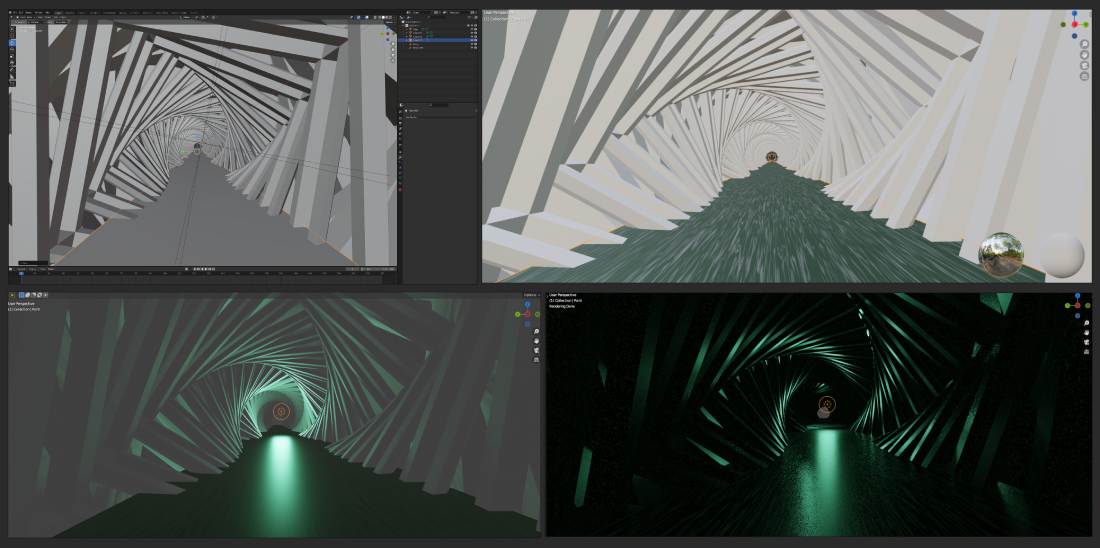
1.6.1
1.7 Scene Preparation
My next idea was inspired by a number of different disciplines. First and foremost by the Great Hall of Moria (LoTR), a youtube video and countless images of ice formations, reflections, semi-transparent/seethrough blue ice.
I made a blockout of the scene (1.7.1) and positioned the main objects and character and finally set the camera facing the exit. By doing this before modelling I get a better perspective how the end result should look like. Next changing to Cycles render preview I positioned the main light (a large area light covering the whole exit) and adjusted some basic settings such as Size, Power and direction. I normally add an extra viewing tab to the default (splitting the screen) that I use to display the camera view in the render engine I am planning to use for the scene. During the 1st year of university I came across this as a suggestion within tutorial videos by many 3D artists. I found it highly beneficial and now it is part of my preparation routine. This way I can constantly see the result of any change.

1.7.1
1.8 Modelling
Most of my project predominantly modelling heavy but over the creation of this scene the heavy lifting was provided by sculpting, shading and PBR materials.
Last year during the RSA project to create a seafloor I used a Blender add-on called A.N.T.Landscape. This tool provides swift terrain generation capabilities. As a consequence of the preset terrains (from canyon to desert dunes) and the array of options the created landscape never looks generic. I chose one of the preset terrains changed it's scale and topology settings (1.8.1). Then I duplicated the topology and rotated it. Finally I joined the two by the Ctrl+J hotkey.
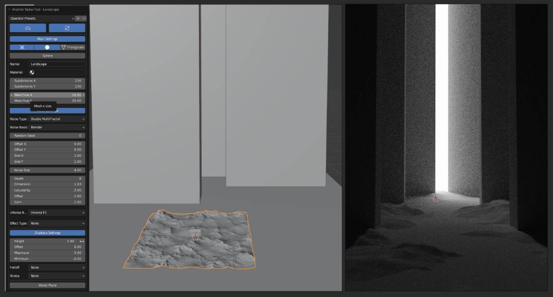
1.8.1
Keeping the poly count low is fundamentally cruicial. High polygon counts require more computational resources to render, resulting in slower real-time performance. This is particularly important in applications such as video games or interactive simulations where real-time rendering is vital. The Level of detail (L.O.D.) system is part of all 3d pipelines. The basic principle is to dynamically adjust the complexity of a model based on its distance from the viewer, ensuring optimal performance and visual quality. Concerning this particular scene the LODs are irrelevant however, to keep the polygon count low I applied a different method I learned last year. If the scene is rendered from a given viewpoint polygons outside the viewing area can be deleted. As landscapes made up of countless vertexes this step can significantly help to reduce the poly count resulting in smoother performance, less memory and storage use and decreased power consumption. This in turn indirectly contribute to a smaller carbon footprint promoting sustainable practices that aligns with the UN SDG 12: Responsible Consumption and Production. Since I intended to take renders from various angles I could not delete vertices outside the set camera viewpoint. Instead from top vertex view I higlighted all the verts of the topography that fell between the boundary of the visible spectrum then inverted the selection and deleted the rest. (1.8.2)
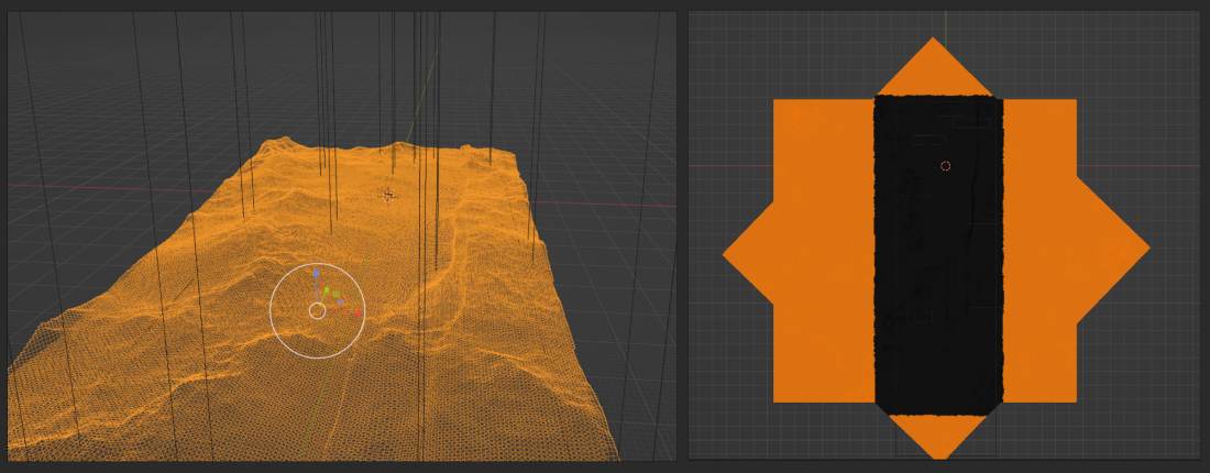
1.8.2
Next using the same landscape generator I made a few cliff face variations and places them around the scene creating an impression of a caved in hall (1.8.3). I added rock boulders and scattered them around the scen for realism. Lastly I added a plane and positioned slightly above the floor level to create a stream/small river in the center leading through the camera's perspective. I subdivided the plane a few times then pulled and pushed the ground topography using proportional editing to create a realistic riverbank.
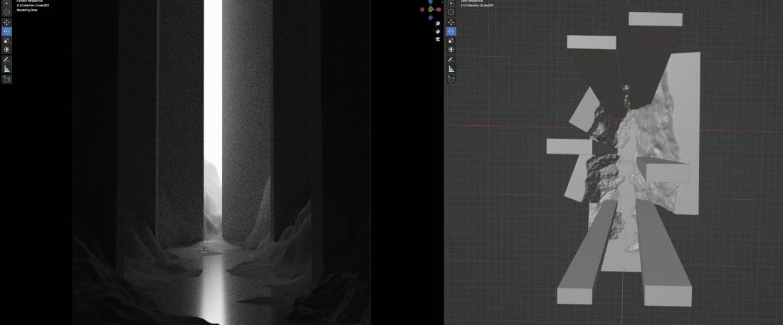
1.8.3
1.9 UV Mapping
The process of UV mapping involves unwrapping the 3D model's surface onto a 2D plane. UV editing ensures that textures align correctly, avoiding visual distortions. For most objects I used 'Smart UV Projections' but for cubical shapes 'Cube Projection' works well. In the UV editing Tab faces can be properly adjusted by scaling, rotating and positioning if necessary (1.9.1).
2.0 Shading
Blender uses a shading model called "Physically Based Rendering" (PBR), which aims to simulate real-world lighting behavior. Assigning different materials to objects or surfaces and by controlling various parameters such as roughness, transparency and so on leads to more realistic and accurate renderings.
Inspiration
Although I saw it a long time ago Steven Spielberg's 1993 historical drama Schindler's List's left a long lasting impression on me. Beside the portrayed horrific events of the Holocaust the movie provided one of the most iconic cinema shots that carries a powerful visual and symbolic meaning. (2.0.1) The shot occurs in a primarily black and white film, but a little girl in a red coat is shown walking through a chaotic scene during the liquidation of the Polish Ghetto. I was hoping to create a somewhat similar effect by keeping the scene mainly black and white apart from the main character Gandalf, who is holding his magic staff illuminating the dark cave.
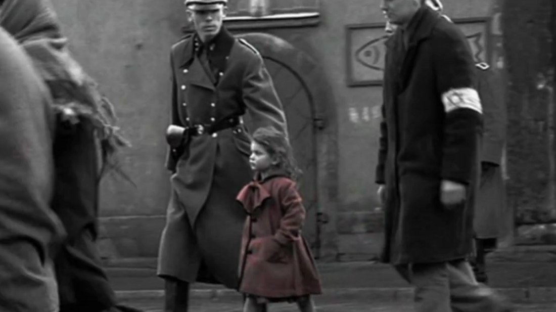
2.0.1 (Timesofisrael.com, 2013)
Once the modelling was finished and assets were permanently placed I adjusted the world properties. Set the background colour to black and begin shading. I applied the same texture and node setup for mall boulders and the cave walls (2.0.2). The Node Wrangler add-on greatly contributed to speeding up the shading process beside granting the option to separately view the effects of each node.
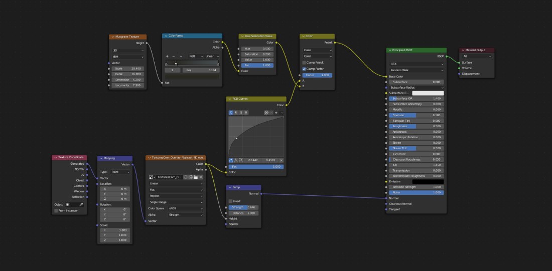
2.0.2
The water texture was made by adding a wave texture and bump node to the Principled BSDF node. Using the below settings the reflection of the surface was intensified.
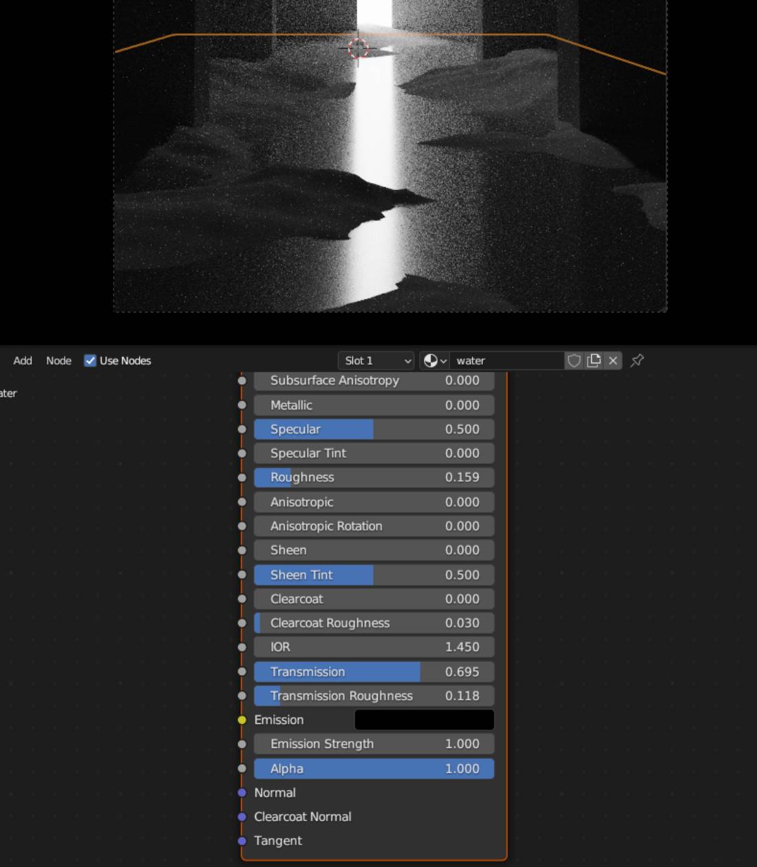
2.0.3
2.1 Sculpting
I found sculpting the ice slabs in Blender to be a fantastic experience as it allowed me to explore and experiment with the unique properties and textures of ice in a virtual environment. Using the advanced sculpting tools and material simulations, I was hoping to create realistic ice formations, capturing the intricate details and translucent qualities of frozen water. Regrettably this modelling method was only partially realised as time constraints neccesitated to focus on other aspects to be able to finish the scene.
I started by experimenting with shape variations. Before I decided to abandone the idea of frozen alien pillars/walls I added loopcuts to the blocks made during the blockout phase. I created faces covered with relatively evenly distributed squares. Using the random select face tool then the extruding the selected individually I constructed interesting shapes. Once I committed beside the ice slabs I deleted the previous objects and instead applied a Multires modifier and increased the Level Viewport, Sculpt and Render levels to 3 (2.1.1).

2.1.1
During sculpting I often referred back to the reference images for better accuracy. I used the pinch, draw, clay, clay sharp tools mainly constantly adjusting the brush radius and strength settings. In order to avoid sharp edges I employed the smooth and flatten brushes. Previous experience with Sculpting proved to be immencely helpful. The sculpting deep dive during year 2 and some personal project contributed to my confidence utilizing the above mentioned tools. Yet I feel should I had more time to spend on this aspect of the project a far greater end result could have been accomplished. The progress of the ice slabs can be observed on the below image (2.1.2).

2.1.2
2.2 Scene Lighting
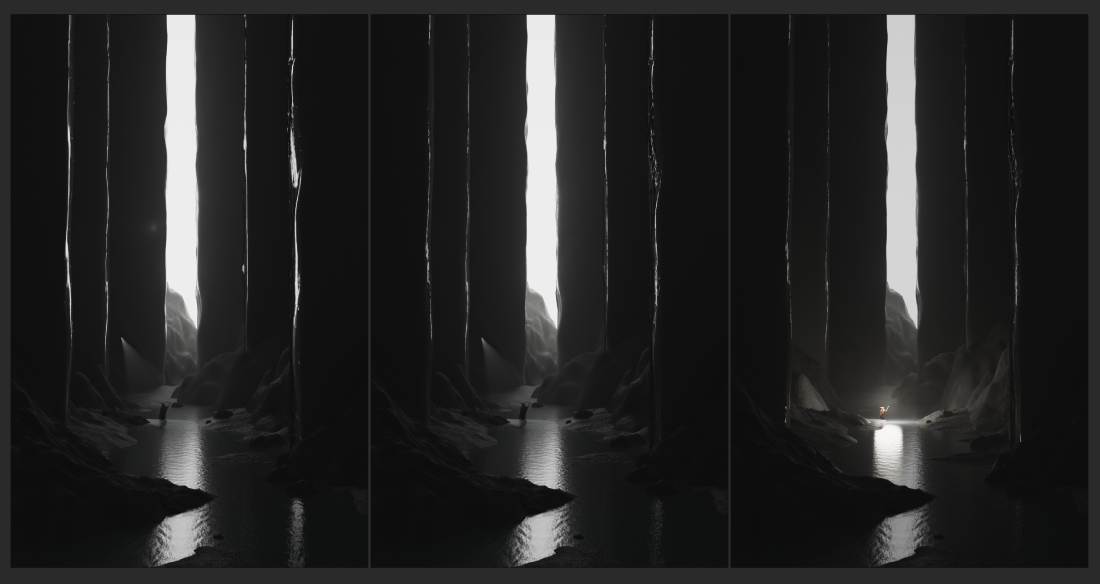
Scene lighting is crucial for creating immersive and visually stunning environments. It plays a pivotal role in setting the mood, enhancing the atmosphere, and conveying the desired emotions to the audience. I started by deleting the area light placed outside the cave exit. This was a major change in terms of aesthetics. The area light did not work for the intended purposes because it did not resembled the qualities of real life lighting conditions. The outside are remained dark, and since the power had to be set to 100000 MW the rendering times multiplied tenfold. On the positive side it changed the ligting inside of the cave rather smooth and pleasing to the eye. Once I replaced it with a scaled up plain and added an emission node it only needed minor tweaking to change the lighting for better transforming the whole ambiance (2.2.1). The illuminated area by light #5 may be observed on (2.2.2).
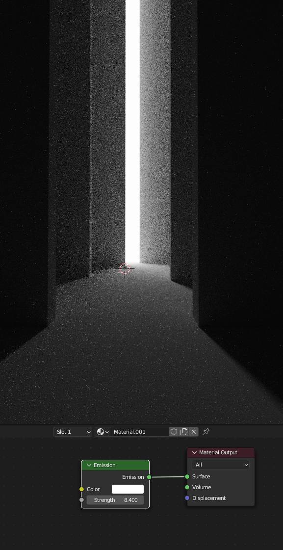
2.2.1
Lighting not only affects the visibility of the objects but also defines their shape, depth, and overall aesthetics. It helps to emphasize important elements, direct the viewer's attention, and establish a focal point. Beside the main light a spot light(#3) was placed and above and slightly behind the main character. The intention was to brighten the sorrounding area. The light emmitted by Gandalf's staff was achieved by a Point Light(#6). Whilst the main light brightens up the whole scene I added three extra Point Lights (#1,2 and 4). The function of these was to highlight the edges and narrow faces of the ice slabs. (2.2.2).
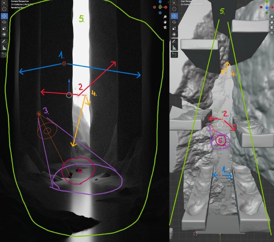
2.2.2
I added a cube and scaled it to enclose the whole scene. Deleted its Principled BSDF and connected the Material Output to a Principled Volume node. I played around with the settings until establishing the following. Density was set to 0.008 and the Anisotropy increased to 0.464 delivering a much needed depth to the scene (2.2.3).

2.2.3
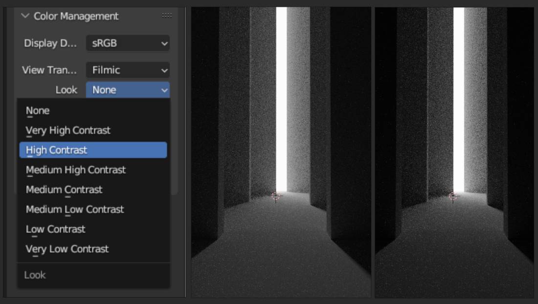
As a last step I toned back the world colour to a slightly lighter shade of black and turned the Look within the Colour Management tab to High Contrast. Similarli I modified the Exposure and Gamma values until I was satisfied with the result (2.2.4).
2.2.4
2.3 Geometry Nodes
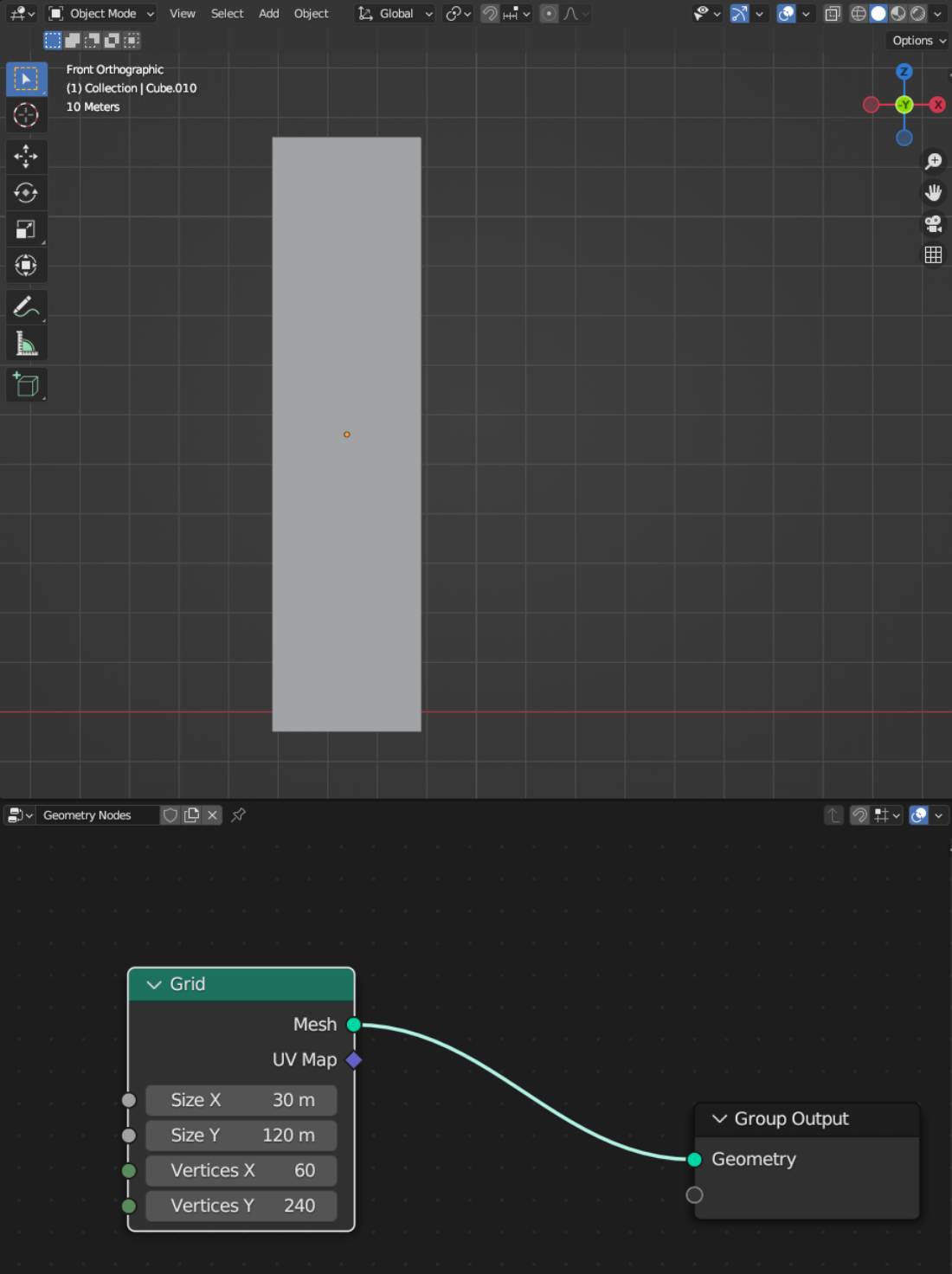
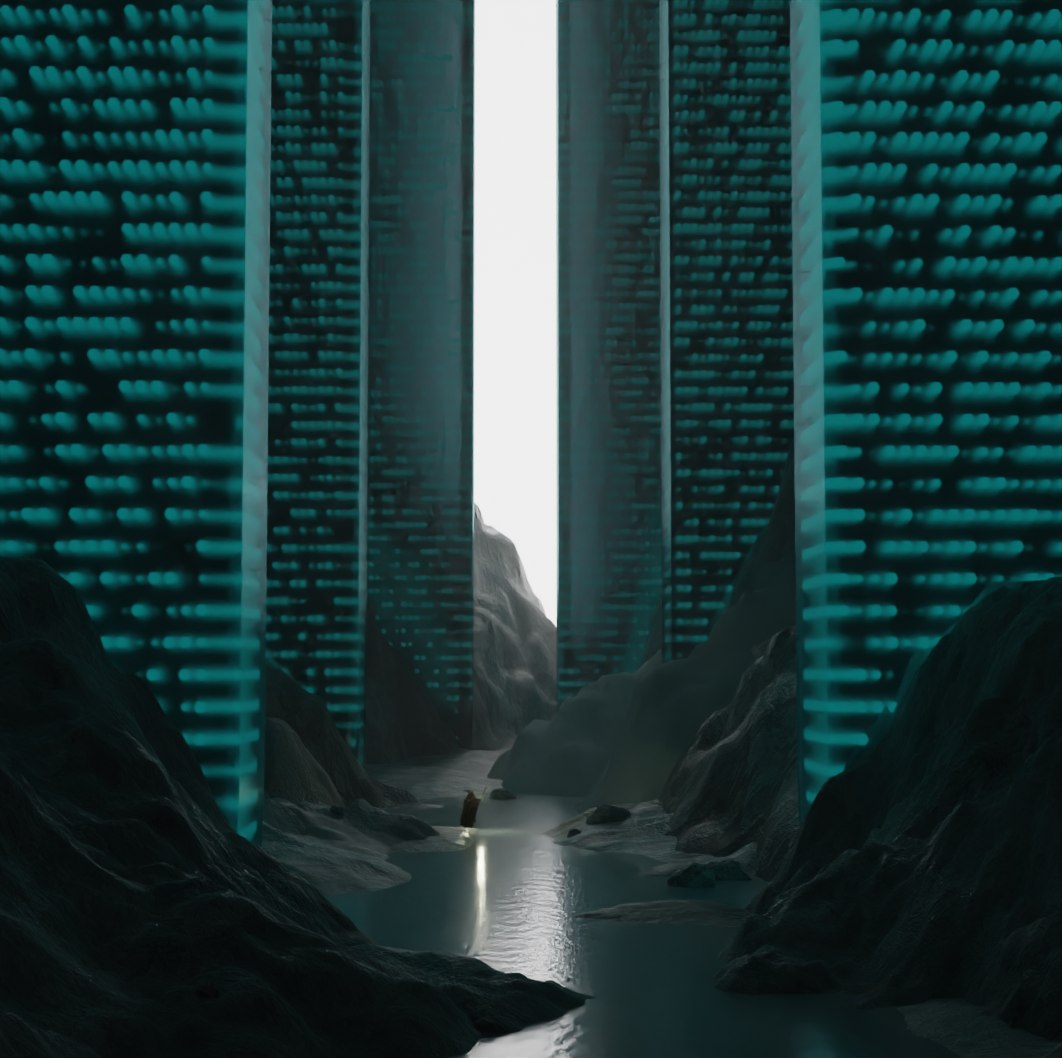
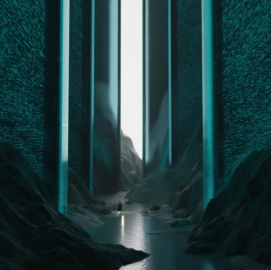
Despite that geometry nodes were introduced in Blender 2.92 I have not experimented with them prior to this assignment. Primarily I sought to familiarise myself with this feature but equally was looking for a viable solution to my wall lighting problem. Initially I was not clear on the world or environment I was to place the cave scene in. When I still considered the caved in alien city its walls needed to express the futuristic architecture somehow. As in many sources I gathered, far into the future civilisations may use lit up walls. I wished to display my intent with semi transparent slabs that encircle these walls which have animated lit up features that emitting a teal or blueis hue. I duplicated one of the pillars and pressed "/" for isolated view (2.3.1).
2.3.1
I connected an Instance on Points node to the Group Output. By adding a mesh (an Ico Sphere node) and a grid Node the base of the lighting structure was formed (2.3.2).

2.3.2
Thanks to a Color Ramp and a Noise Texture node I was able to create the backbone of the animation. (2.3.3).

2.3.3
I changed the number of output dimensions from 3D to 4D and using the Color Ramp I create size variations in accordance with the Noise Texture. (2.3.4).

2.3.4
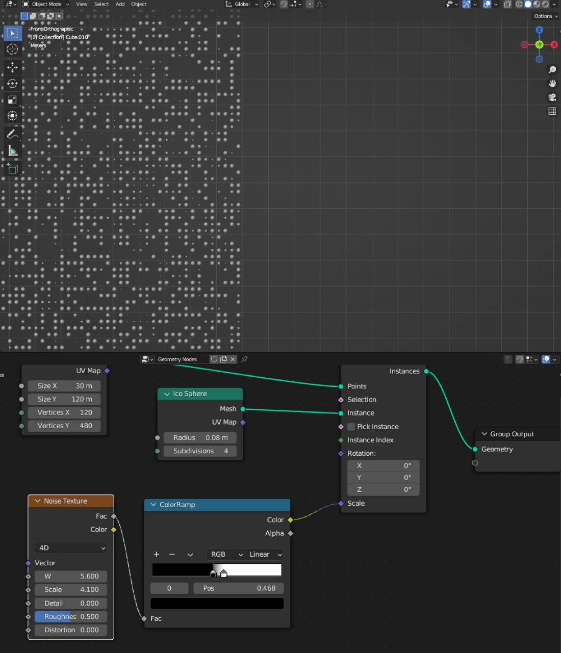
Increasing the Position of black colour or decreasing the white colour within the Color Ramp node offers the opportunity to adjust the size of the mesh by separate colour groups (2.3.5).
2.3.5
By decreasing the scale on the Noise texture I was able to enhance the intricacy of the grid (2.3.6).

2.3.6
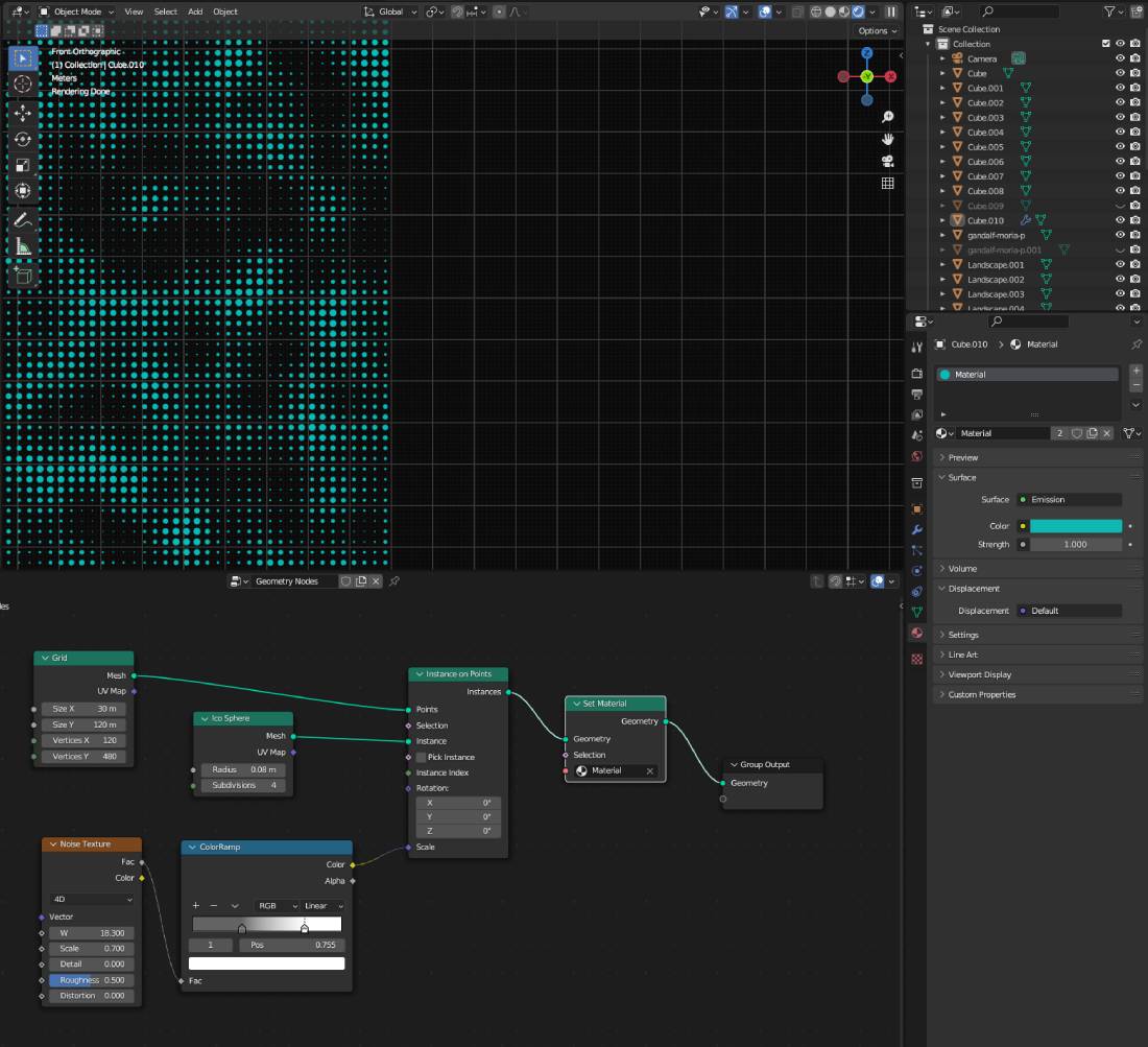
The added Emission node and adjusted emission strength and colour within the Shading Tab delivered the futuristic ambiance. Back in the Geometry Nodes tab Color Ramp I eased down on the black colour and shifted it towards a medium grey. As a result the noise transition can be manipulated giving the edges a more organic look (2.3.7).
2.3.7
I experimented with differring shapes swapping the Ico Sphere to Cubes and reduced the X and Y vertices coordinates controlling the shape of the cube altering it into a cuboid (2.3.8).
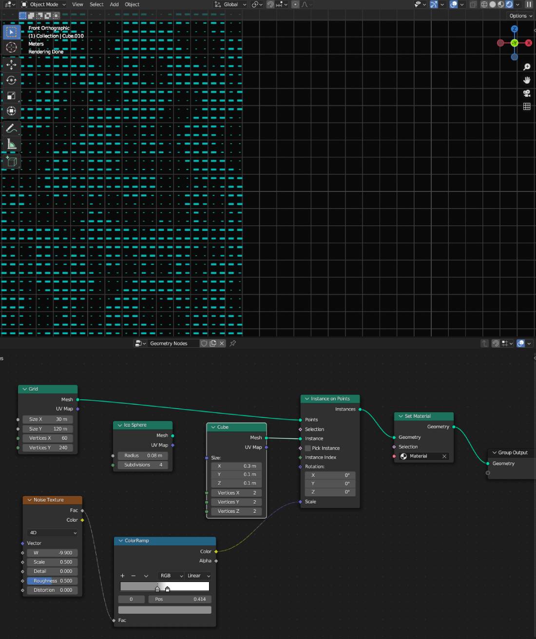
2.3.8
Again I swapped the Cube node with a Cylinder and adjusting the Color Ramp positions and Noise Texture parameters provided a different pattern (2.3.9).
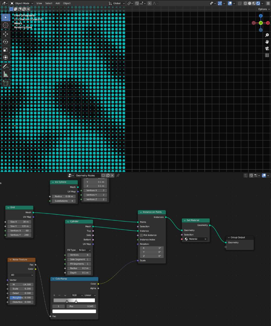
2.3.9
Varying the X and Y vertex coordinates aspect ratio in a non-linear way granted a dispopportionate grid/noise level (2.3.10).
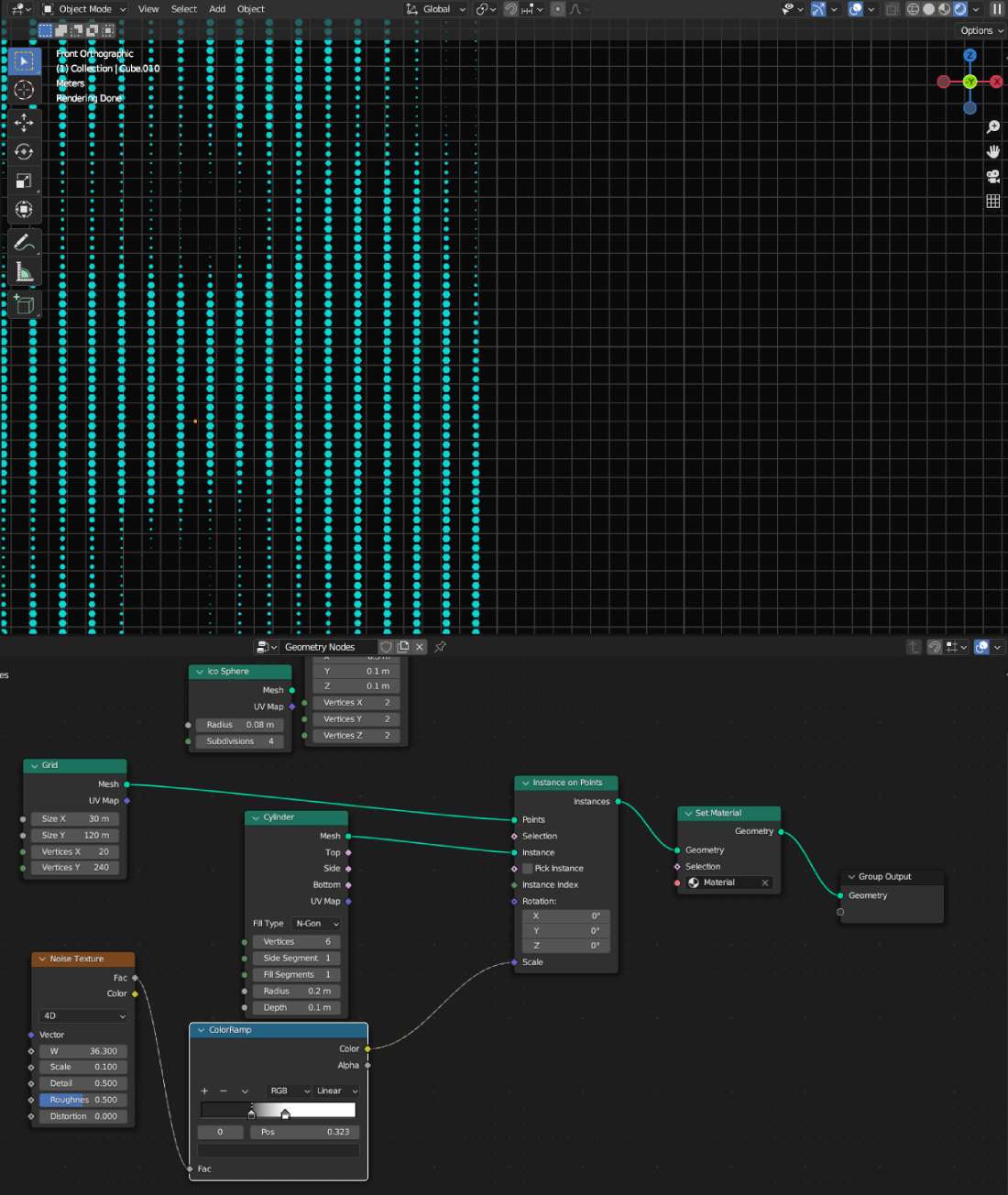
2.3.10
I increased the depth of the cylinders to add an extra dimension. Doing so the cylinders filled the ice slabs width (2.3.11).
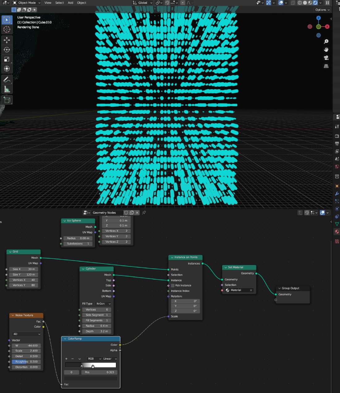
2.3.11
2.4 Rendering
Testing a great number of settings provided various results. The image below shows the improvent in lighting. (2.4.1).
2.4.1
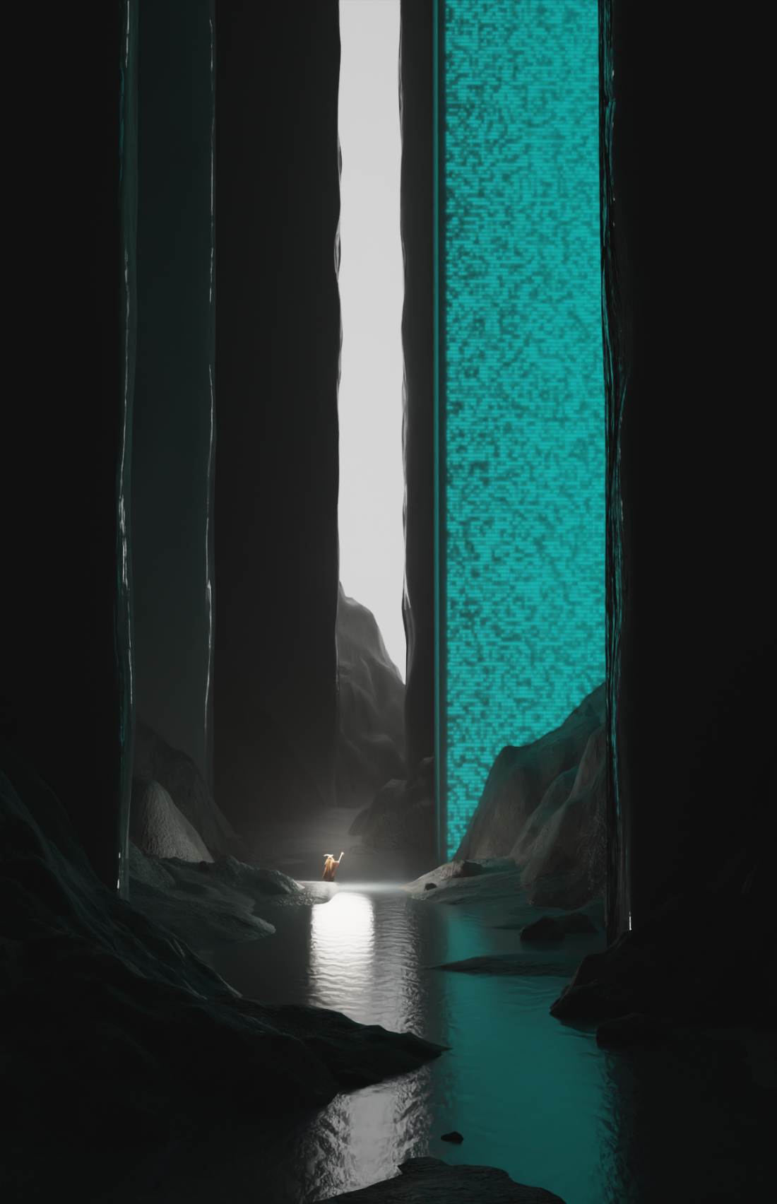
Eventually I gave up on the animated lighting idea. When my computer broke down and lost one of my hard drives in the process I had to redo almost the entire project from zero. Additionally since I did not have a quick solution to fix the water cooling system I had to revert to substantially lower render specs. Originally I was planning to set the Max Samples to around 4096 for still beauty renders and a bit more modest number for the animation. I tryed rendering with 1024 Max Samples but the rendering time increased to an absurd amout. Due to the above I excluded animations and only rendered a few still images with samples between 100-400 to avoid overheating my GPU and CPU. (2.4.2).
2.4.2
2.5 UN SDGs
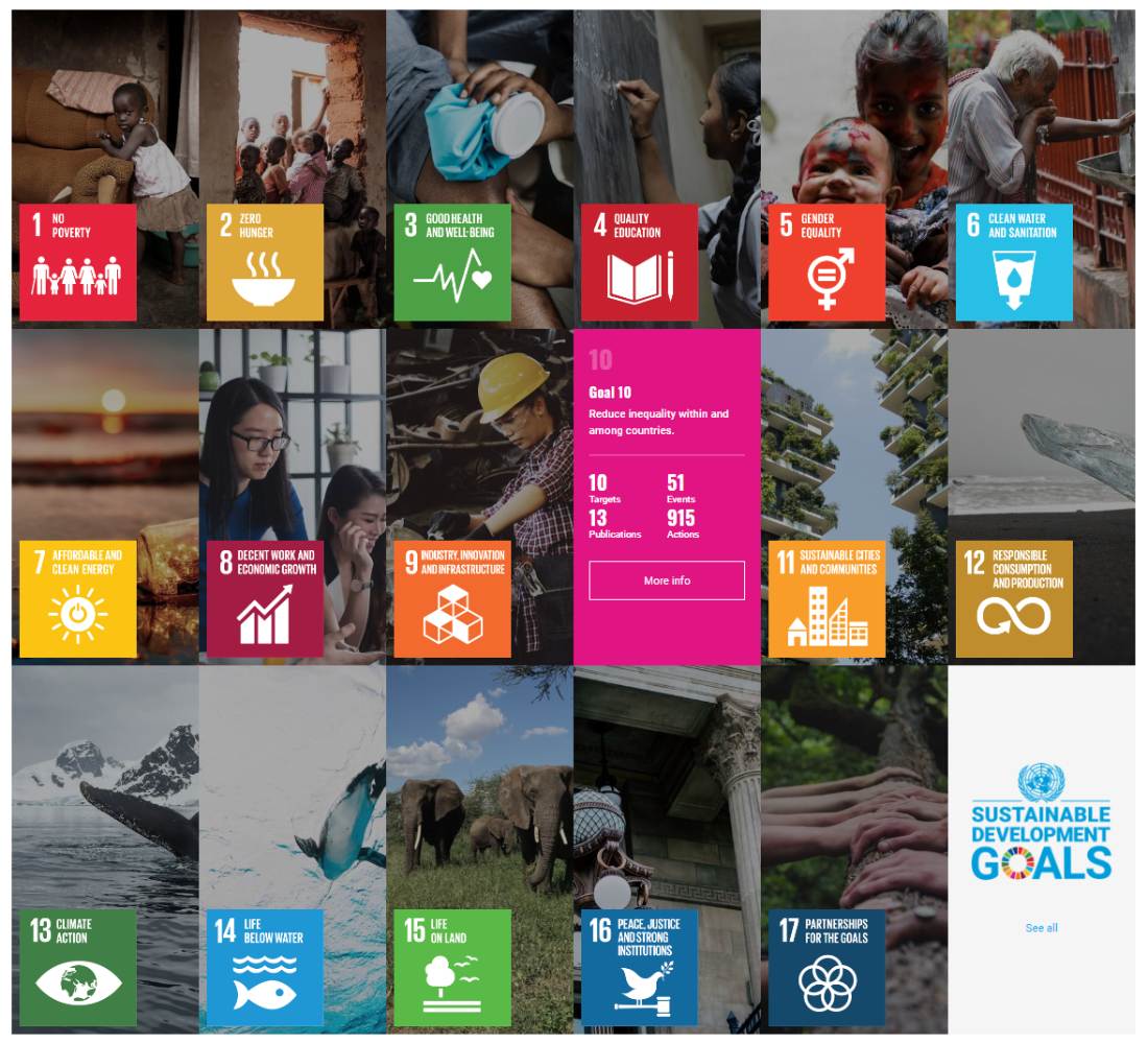
The United Nations Sustainable Development Goals or Global Goals are 17 objectives serving as a shared blueprint between the 193 member states to combat issues such as poverty, inequalities, and climate action (2.5.1). SDGs are the world’s call to action on the most pressing challenges and opportunities facing humanity and the natural world. (SDG report 2021/22, 2021)
2.5.1 (Un.org, 2015)
SDG 10 aims to reduce inequalities within and among countries (2.5.2). While the direct connection between the creation of these two projects and SDG 10 may not be immediately apparent, here are a few examples how I try to advocate and adhere to it.
On a personal level:
On a rofessional level:

2.5.2 (Reduce inequality within and among countries Change in between-country income inequality, 2013)
2.6 Time Management
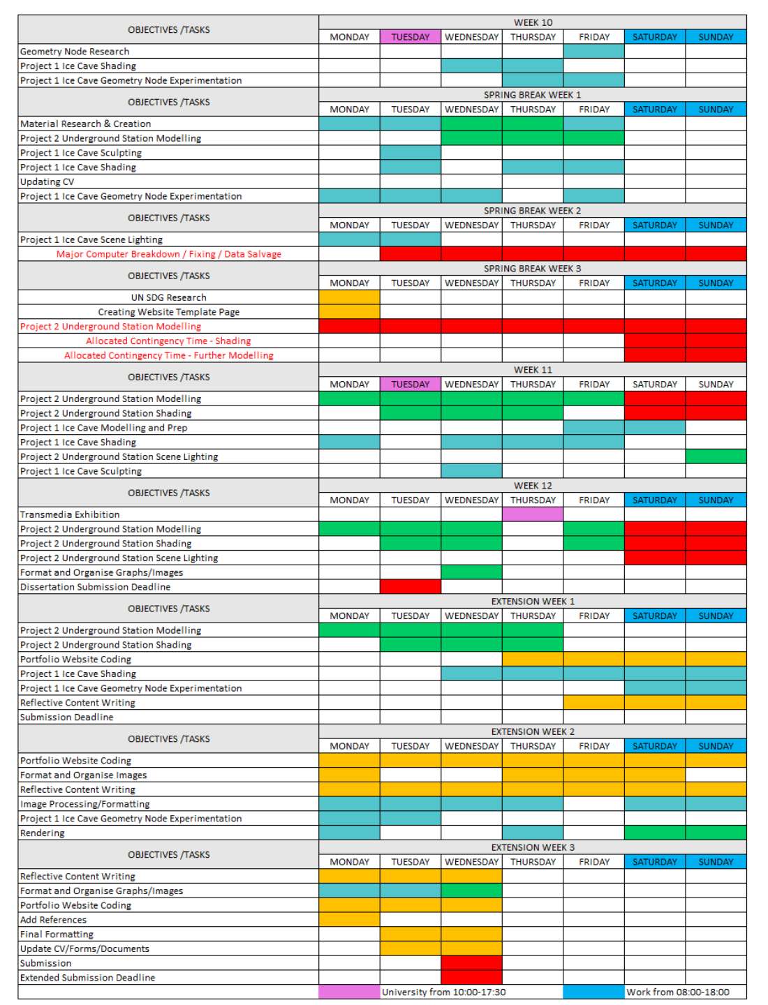
I managed my time meticulously for my 3D work, covering every aspects of the design process. The process began with brainstorming, extensive research and idea generation, followed by dedicated hours for designing, modeling, shading, UV mapping, and rendering. The below Gantt Chart shows the work processes in daily increments (3.0.1). For a timely insurance, I allocated contingency time-slots for most weekend evenings after my part time work. Unfortunately, despite all precautions, my computer unexpectedly broke down, resulting in an irreparable hard drive and the devastating loss of well over 100 hours of my 3D work. As a result, I had to request a deadline extension to accommodate the unforeseen setback and allow for the recreation of the lost progress. The 2 weeks extension could however, only cover a portion of this as considerable amount of work was required to complete the writing, coding, and image processing of corresponding reflective process portfolio. Therefore the second project received no written narration. Nevertheless the progress can be followed through the regular screenshots depicting all steps leading to the final renders after the references section.

2.6.1
2.6.2
2.7 Conclusion
Throughout my final year, I welcomed the challenge of working parallel on two 3d projects. Every assignment presents its own set of problems and obstacles to overcome. By working on multiple projects simultaneously, I exposed myself to a broader range of challenges and problem-solving scenarios. This in-turn can sharpen critical thinking abilities and expand problem-solving skills, making me more resourceful and adaptable in my future artistic career.
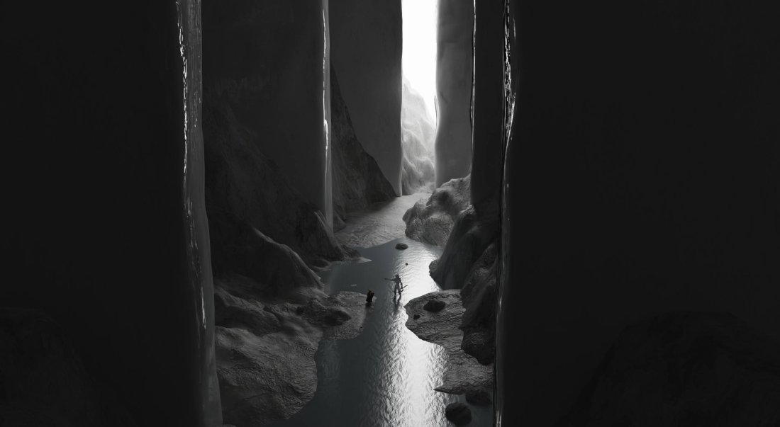
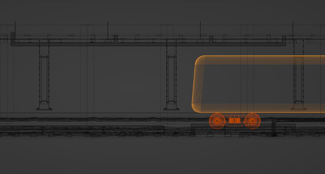
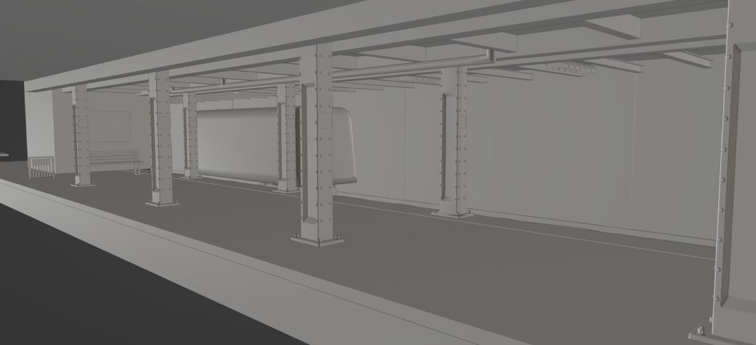
Unfortunately, an unexpected computer breakdown resulted in the loss of an entire week for repairs, along with over 100 hours of painstaking 3D work. Although the extension period provided some relief, regrettably, I was unable to complete the Underground Station project and had to relinquish its reflective report.
Among the projects I undertook, the Icy Cave Project held a special place in my heart. It afforded me invaluable insights into scene lighting, shading techniques, poly count optimization, and the effective use of geometry nodes. I am proud of the end results.
My three years at the university were profoundly transformative, both mentally and creative challenging yet stimulating. My dedication to becoming a 3D environment artist allowed me to acquire a diverse skillset. I mastered various software skills, industry-standard practices, and adopted a professional mindset. Not only did this experience enhance my portfolio, but it also significantly elevated the overall quality of my work.
The privilege of learning from lecturers who were not only experienced educators but also industry professionals was an incredible learning opportunity. Moreover, working alongside my talented peers, who possessed their own unique perspectives and creative abilities, was truly inspiring.

2.7.1

2.7.2
2.7.3
2.7.4
2.7.5

2.7.6
2.8 References
SDG report 2021/22 (2021). How the UN Sustainable Development Goals inform The University of Manchester’s work. [online] The University of Manchester. Available at: https://www.manchester.ac.uk/discover/social-responsibility/sdgs/ [Accessed 27 May 2023].
Reduce inequality within and among countries Change in between-country income inequality. (2013). Available at: https://www.un.org/sustainabledevelopment/wp-content/uploads/2022/07/Goal-10-infographic.pdf.
Un.org. (2022). Goal 13 | Department of Economic and Social Affairs. [online] Available at: https://sdgs.un.org/goals/goal13 [Accessed 01 Mar 2023].
Timesofisrael.com. (2013). Schindler’s ‘girl in red’ grows up. [online] Available at: https://www.timesofisrael.com/schindlers-girl-in-red-grows-up/ [Accessed 17 May 2023].
Games, H. (2020). What makes a good portfolio for an Environment Artist? [online] Medium. Available at: https://medium.com/@chdesignsuk/what-makes-a-good-portfolio-for-an-environment-artist-8cb7947f791 [Accessed 03 Mar 2023].
Un.org. (2015). THE 17 GOALS | Sustainable Development. [online] Available at: https://sdgs.un.org/goals [Accessed 30 May 2023].
2.9 Underground Station
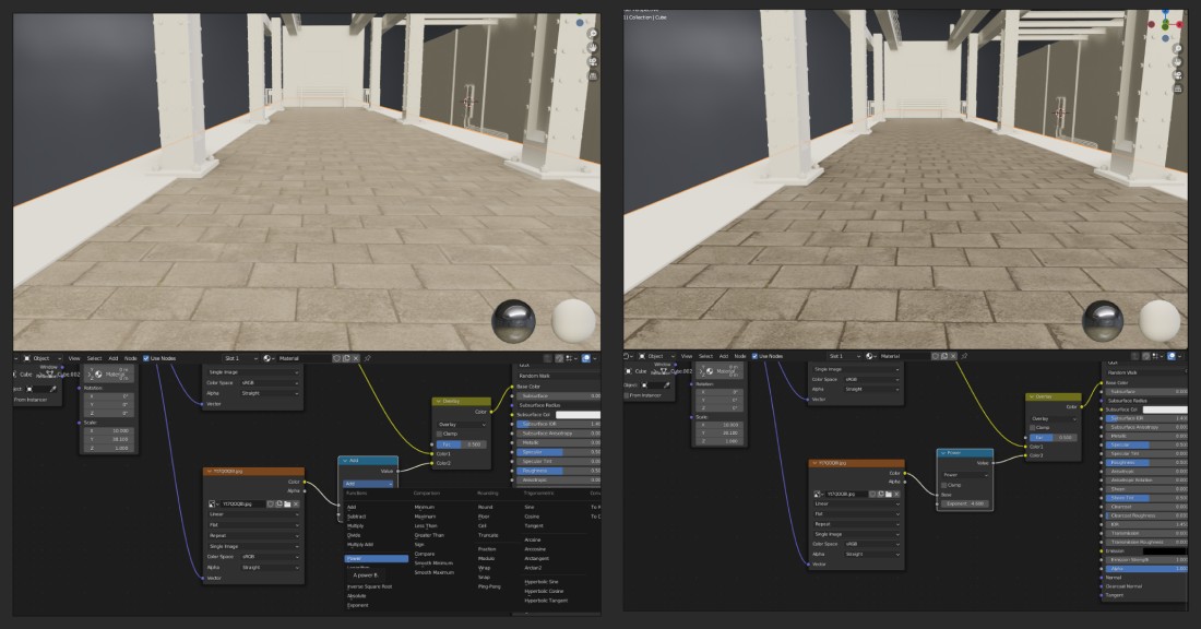
The below images show the progression of the semi-finished Underground Station project. (2.9.1 - 2.9.8)

2.9.1
2.9.2

2.9.3

2.9.4
2.9.5
2.9.6

2.9.7

2.9.8