Software
Sublime Text 3
Adobe Photoshop 2021
HandBrake 1.3.3
1.1 Concept
Possibly the most important project I worked on this year is my portfolio website. Not only representing my work and progression throughout my university years but also the gateway to professional career. It was an assignment full of challenges that sometimes seemed impossible to overcome but also an inspiring experience I enjoyed thoroughly.
1.2 Design Dilemma
From the beginning I had a clear idea what I wanted to achieve however my coding skill had much to improve. For this very reason I decided to have two versions of the website making the choice dependable on my development. Plan A was a full on animated website with striking colours (1.2.1)and Sci-fi style typography embracing a gamer theme inspired by the computer and tabletop rpg Cyberpunk. (1.2.2). The other variant was a more reserved subtle yet elegan design. It was based on a picure of a CV I found on canva.com. (1.2.3) The colour palette sill had contrast and at the time seemed more professional.(1.2.4)
1.3 Structure
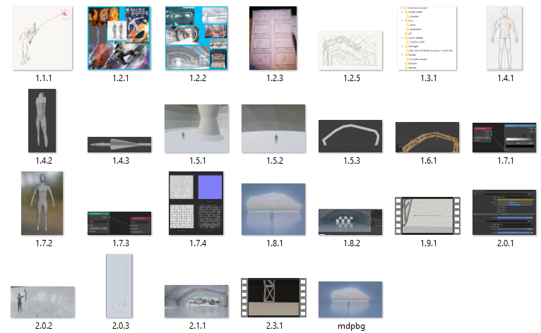
1.3.3
1.4 Wireframes
Wireframes are important part of planning ahead of development. I made two sets for each webpage as required but as my ideas evovelved numerous changes were made. Typically I hand-draw my wireframes or use a graphic tablet and a drawing app such as Adobe Sketch to quickly gain a visual sense of the website. (1.4.1, 1.4.2)
1.5 Web Development Practice
As part of the DM1111 Development Principles modul a number of exercises were completed with the guidance of my lecurers. Although these weekly assignments only introduce basic concepts within HTML and CSS yet they are important milestones of skill evolution. The first image simulates a plain webpage layout (1.5.1) while the second image is an exact replica(intentionally with the spelling mistake) of Jake's Cofee Shop. It contains a navbar and also populated by image, text and a link.
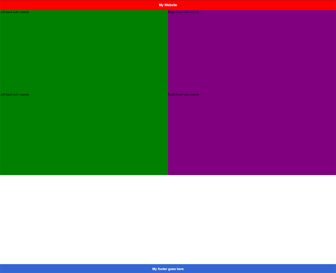
1.5.1
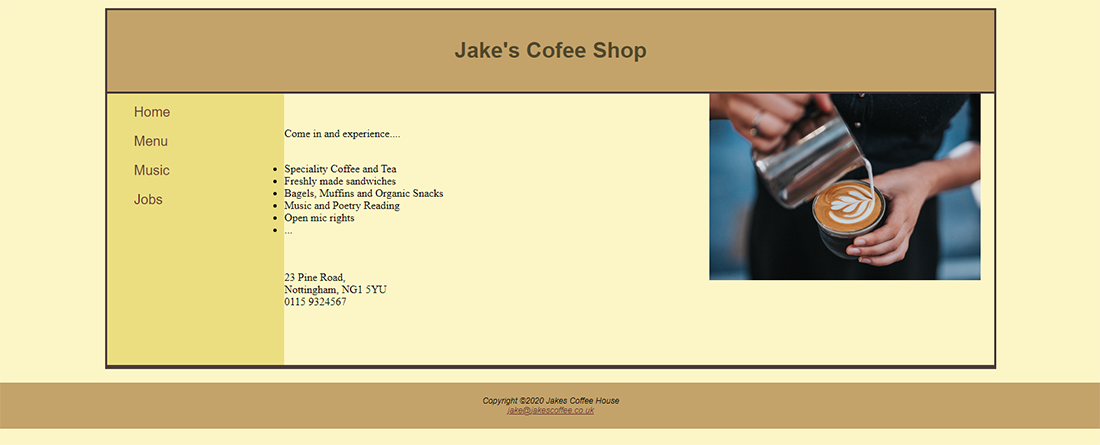
1.5.2
1.6 First Portfolio Website
Concluding my first semester university assignments my first portfolio website was somewhat simple. My knowledge in HTML and CSS did not give me the confidence to chose a visually more engaging animated website. I kept the coding uncomlicated with only a few images.(1.6.1)
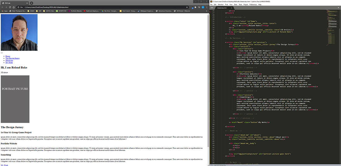
1.6.1
1.7 Site 2.0
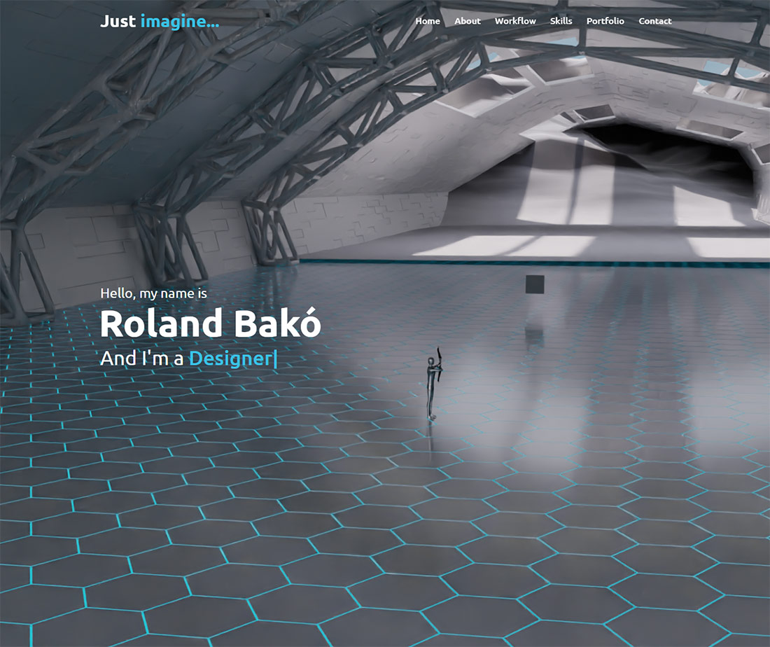
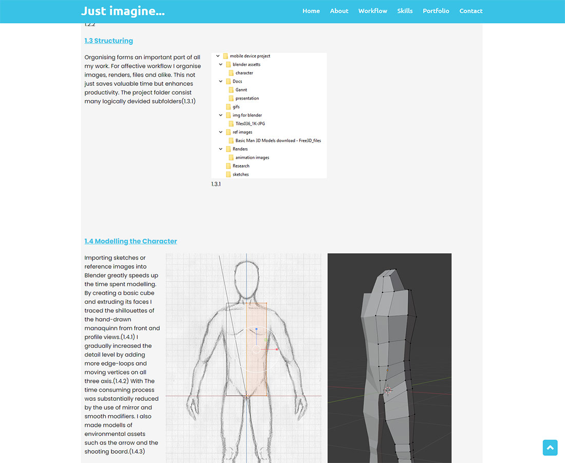
Learning from the mistakes of R3DLAB my firts portfolio website a seconcond feature rich version was forged. Nevertheless I still was not pleased with it's layout and I built an almost brand new site.(1.7.1) I focused on visual storytelling and attempted to guide virtual visitors through the milestones from pencil drawn wireframes to a live website not only showcasing my work but intending to demonstrate my thought process, and follow up actions.(1.7.2) Incorporating the feedback of peers but especially my lecturers I structured all projects and build a framework that I applied as a costumisable base.
1.7.1
1.7.2
1.8 Navbar
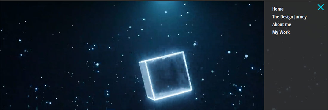
One of the first change I made was to reposition the navigation bar. In last semester's version a hamburger type nav icon opened the side navigation panel.(1.8.1) In favour of gaining extra screenspace I replaced it with a sticky, responsive navbar. By changing the opacity settings without scrolling the navbar remains transparent only the contained items are visible.(1.8.2)The bar itself and the nav items all change colour when scrolling down.(1.8.3)
1.8.1

1.8.2

1.8.3
1.9 Typing Effect
During my research I discovered design features I wanted to integrate into my construct. Similarly to the small website icon displayed in the left corner of the browser called favicon another element is the typing effect. It is a small animated text however it adds detail and individuality the generally plain text subtitle.(1.9.1)
1.9.1
2.0 Preparation
Undoubtedly my most important information source in terms of coding solutions beside DM1111 the Development Principles modul was W3 Schools. For icons and fonts I used Google Fonts and Font Awesome. I gained invaluable experience from Youtube videos and tutorials. One of the most challenging and time consuming task throughout the project was to get a clear understanding of css grids. Without The coplete guide to css grid by Dev Dreamer this website would certainly look entirely different.
2.1 Conclusion
I started building this website with minimal coding knowledge. Although prior to this project I worked with Adobe Dreamweaver my skills were limited. I naively imagined my website containing maybe a few images and few hundred lines of code. I invested hundreds of hours through the span of the first year to practice and learn new techniques. Currently the site containes well over one hundred custom images, animations, graphs and other files and built upon almost 4000 lines of code. I wery much enjoyed working on my Personal Portfolio. Looking ahead I plan to dive into glass morphism and 3JS to import 3D assets from Blender and incorporate them for a unique style.